In last weeks’ post “Bounce Rates in Higher Ed: The Good, the Bad and the Ugly” we defined bounces and bounce rates, explored the statistics on bounce rate in general and in higher ed specifically. This week’s post is a little more practical and applied in nature. We’ll review the kinds of things you need to consider to reduce the immediate loss of visitors on your high bounce pages (or web site sections) and increase student engagement, lead generation and registration opportunity for your institution.
Strategies to reduce bounce rate break down into three general categories: page content, page design, and related technical elements. Most can be applied at any level, (page, section or site wide), so remember it’s up to you to determine at which level the bounce problem lies and then to apply the most appropriate tactics to address the problem. This list is more directed at improving general web pages vs highly focused landing pages. For more information about how to reduce bounce and increase conversion rate of lead generation or registration funnel pages see other posts about conversion rate optimization (CRO) and landing page optimization.
Because this list covers so much ground I have kept it in point form to try and keep the information as accessible as possible. Hope this helps
Page Content
1) Produce High Quality Content
– Nothing beats interesting, relevant, current, visually stimulating content.
– Keep you content up to date,
– Make sure it is at the right reading level
– Split up your content into digestible chunks that people can scan and then dig into
2) Offer Content Based on Visitor Segmentation
– Break down you audience into their respective segments and provide the content each wants
– Study the keywords visitors use to find you with. Some bounce higher than others. Find out why.
– Analyze your internal site search to identify what people are most often looking for on your site
– Consider your visitors points of entry to reveal what they are looking for and give it to them
3) Make it Clear What’s in it for your Visitor
– Make your messaging really obvious, be clear what you do and what you offer
– The features of your programs are great but visitors are more interested in the benefits. Convey value.
– Make related content accessible. Proximity of the link will determine the click-through
– Make your website sticky
4) Be Trustworthy and Professional,
– Trust is required for a visitor to engage with you and enter your recruitment funnel. Earn it.
– Always keep your contact info front and centre. It is amazing how many don’t.
Page Design
5) Correct Poor Page Design
– This is a pretty obvious recommendation but don’t take it for granted. Many pages flow out of you general design, get tweaked, get repurposed, get lost and lose their ability to engage or convert.
6) Make Pages Visually Engaging
– Visual engagement is the first hook that draws visitors into your content. Use eye-tracking, check In-page Analytics etc. to understand a student’s first reaction to your pages
– Be predictable in your design, using consistent placement and formatting so that the visitor quickly learns where to find things
– Whitespace is a good thing, use it often
7) Don’t Interrupt the User’s Experience
– Develop intuitive navigation so the student can see their way into your content
– Take people where they want to go
– Manage multimedia very carefully – some is good at engaging, some makes people bounce
– Many institutions use a lot of internal “advertising”. Be careful of it’s placement and page priority as it can be just as off-putting as a telemarketing on a Sunday afternoon.
8) Design Information around Page Priorities
– Are your target conversion or content points clearly presented on your page?
– Can students immediately get a sense of what they should expect to find or are expected to do while on the page?
– Respect visitor intent by making sure the page you are presenting to visitors aligns closely with the content promised from the source link
– Make conversion events (ie calls to action, forms, key related links) very clear. Place them above the fold
9) Go responsive web design or create a parallel mobile website
– People searching for information about your college on a mobile device need to see a page that is sized to the format of their device. Full web pages served to a smart phone will almost always bounce.
– Successful student engagement through mobile pages has different rules than for traditional desktop pages. Take a minimalist approach and then learn through experimentation what will work best for your institutions offerings.
Technical Elements
10) Improve Page Load Times for high bounce pages
– optimize content, images, multimedia etc to minimize your page load times
11) Check Browser Performance for high bounce pages
– it’s always possible that something in your code is not working for one specific browser, and the page is not loading in that browser. This is a surefire way to cause visitors to bounce.
12) Open External links in new Windows
– a good example here would be in a univerity’s student ambassador blog. That link they embed in their story will lead the visitor away, often with no way to return if a new window is not opened for the outsid link.
13) Create Unique Titles and Meta Descriptions for each Page.
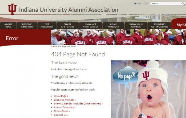
14) Have a helpful, funny 404 message
– if someone tries to enter your site and gets a 404 “page not found “message you must have a engaging response if you hope to keep the student on you site. It is also a great place to have a little fun and show some personality
Indiana State University 404 message
A Note on A/B Testing
15) A/B Test your Pages
– I am a huge advocate of A/B testing. To really drill down at the page level and determine what is causing your bounce problems and what will fix them, you need to start working with the A/B testing module called “Experiments” in Google Analytics. This is particularly useful for landing pages but remember that, in fact, every one of the pages on your website is a landing page, regardless if it is a visitor being brought to that page from a long-tail Google search or a deep link from a referring site.
I do hope this shopping list of strategy and tactics will help you identify and correct bounce rate problems in your college and university website. Please remember that bounce is relative and you need to look at in context of your site objectives and “goals”. We would love to hear about your experiences managing bounce rate for your institution’s site and the tactics you have used most effectively control this element.


