
Have you ever wondered how things may have turned out if you’d gone with plan B?
Perhaps you’ve second-guessed a career move. Or struggled with something as seemingly innocuous as selecting the right date for an important meeting: would Wednesday afternoon have proven more beneficial than Monday morning? Would the dark suit have made a stronger impact than the beige?
Higher ed marketers spend much of their time speculating about untried tactics in the quest for more highly targeted, reliable ways to connect with leads. We try this, we try that. Increasingly we rely on analytics and quantitative research to mistake-proof our marketing decisions. And this approach has indeed yielded some impressive results. But still we wonder: would Robert’s landing page design have performed better than Sandra’s? Both CTAs look good – which one will generate the most leads?
Short of running costly comparative campaigns, one way to eliminate the guesswork is A/B testing. By simultaneously tracking the results of both choices, you won’t have to wonder about plan B – you’ll know exactly how things turned out.
Here are 3 ways A/B testing takes the speculation out of student recruitment:
1. Your Leads Design Your Landing Page
The 2013 Econsultancy Report identified A/B testing as one of the top seven tools marketers should focus on to increase website conversion – regardless of industry or target audience. And according to HubSpot, A/B testing your landing pages can help you get up to 40% more leads for your business. And it works so effectively because essentially, you use input garnered directly from your leads – tracking what they do and don’t respond to – to optimize the pages.
One way we suggest you get started is by creating two entirely different versions of the same landing page, and then using the A/B tool in your marketing software to test how leads respond to both formats. This approach is better than dissecting your existing page, micro-testing how changing a single button shape or background shade impacts clicks. Those elements are indeed important and should eventually be tested as well – but it’s better for school’s to start big and then make finer tweaks as they go. For each of your test pages, make changes to colour, layout, image selection, text, the number of fields in your sign-up form. Here’s an example of two landing pages, ready for A/B testing:
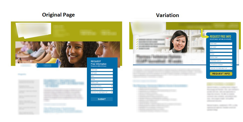
Google Analytics has a built-in A/B testing option that higher ed web designers can use to test their own landing pages. Here’s how they track and display the conversion results of two different landing page designs (in this example, the variation out-performs the original):
Once you’ve determined which page performs better with your leads, then you can begin testing its components: fonts, a particular image, the background colour…and of course, the landing page CTA.
2. Tailor CTAs To Student Lead Personas
If you’re still on the fence about whether A/B testing can help your school convert more leads, consider this: in the early days of President Obama’s run for office, his expert marketing team ran A/B tests on campaign webpages to generate more subscribers. In particular, they focused on a CTA that was underperforming. It was bright red and commanded visitors to “Sign Up.” Obama’s team created and ran tests on several alternatives, including “Learn More,” “Join Us Now,” and “Sign Up Now.”

The A/B test revealed that the “Learn More” CTA garnered a whopping 18.6 percent more signups than its competitors. This insight, combined with a few simple layout changes to the page, ended up scoring the website an incredible 40 percent increase in subscribers. It turned out that Obama’s subscriber persona didn’t like taking orders. They preferred an invitation to an outright demand.
Does your admissions office understand the character and preference of your school’s lead personas? Take a look at this example of a higher ed CTA from Trebas Institute:

If Trebas wanted to A/B test this CTA, they might begin by trying a different background colour. Then, they may decide to investigate whether stripping down the CTA to only two offers gets more clicks – perhaps just Request Information and Apply Online. Each test will bring them closer to a higher conversion rate. Here’s another example from John Cabot University’s admissions landing page:
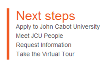
John Cabot may want to find out if enclosing the entire CTA in a box increases clicks. And then they might add a bright background colour and see how that change impacts performance. It wouldn’t take long to determine which variation performs better.
Software like Optimizley, Visual Website Optimizer, and Unbounce make A/B testing much easier than in previous years – you don’t have to be a big data expert or coder to interpret these results. HubSpot is another resource for user-friendly CTA testing. This is how they demonstrate the comparative performance of two CTAs:
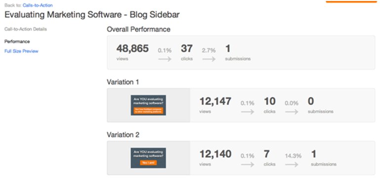
Results like these underscore what Obama’s marketing team proved so dramatically: a simple change in phrasing or format can incite users to click and ultimately, to convert. And with feedback this detailed, you’ll never again wonder why some offers out-perform others. Instead, your recruitment team will be busy leveraging a richer understand of your school’s lead personas – the foundation of any effective higher ed marketing campaign.
3. Irresistible Emails
Email campaigns are a great way to reach out to leads directly and market your school’s programs – so long as leads actually open your message. Your recruitment team may have noticed that certain variables, like subject line and time of day, can have a great impact on whether your emails get clicked – or moved directly to the trash. How can you increase the probability that your recipients will open your message and behold that CTA you tested and customized so beautifully? Well, starting with one change at a time, you can use A/B testing to evaluate and refine a range of email variables:

Tools for running A/B tests on emails often look like this example from MailChimp:
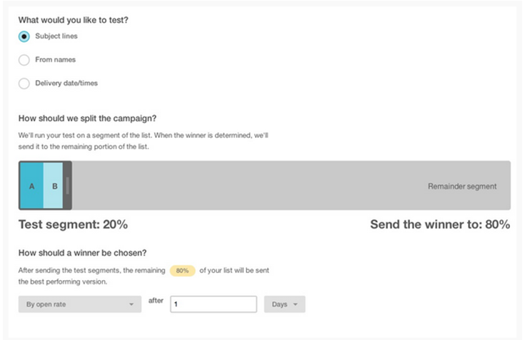
And this example from Campaign Monitor shows how the latest software allows users to define the parameters of an A/B email test:

Your school gets the test feedback to optimize additional campaigns, and also the benefits of having the winning design sent out automatically to contacts. The system provides real time results by putting positive outcomes to work right away. Then if you like, refine the emails further by comparing the winner to another version you’ve crafted that tests another variable. Because of its potential to achieve an unprecedented level of customization, A/B testing is now considered a must-have for higher ed lead generation.
At this point, it’s gone way beyond wondering how plan B might have boosted your school’s conversion rates. With a range of testing tools at your disposal, you’ll be leveraging insights from plans C, D, and E – optimizing your campaigns and gaining continuous insight into your programs’ lead personas, all at the same time.
And now, a little test of our own:


