When CGI film studio juggernaut Pixar unveiled its interactive website for Monster’s University, designers took to Twitter, praising it not just as a marvel of design, but also as a stellar (albeit parody) example of how higher ed websites should look and function. When an in-film joke can outdo most real sites, surely there is plenty of work to be done to perfect the post-secondary web experience.
Every year, hundreds of thousands of prospective students scour the web in search of a school and pathway to a profession well-suited to their interests. According to Thinkwithgoogle, 77 per cent of students will visit a school’s website prior to applying. The internet demand for information about higher ed grows year by year, yet a surprising number of schools do not even have the basics to attract their most valuable personas.
Oftentimes, if the school does have at least the bare minimum on its site, the dated designs tend to bury the features in an unnavigable maze rather than play them up as fresh, timely adjuncts the university offers. In 2015, where 33 per cent of students take at least one online class, no longer can a college afford to think of its website as an afterthought.
Here are four common though oft-overlooked features any higher ed website needs to boost education lead generation and increase enrollment.
News Feed, Blog – or Both?
When it comes to education websites, it’s important to keep news relevant, fresh and up to date. Larger universities often feature both a news section as well as a blog, though for smaller institutions it may be best to choose between one or the other.
A news section is the best way to immediately alert visitors that you have your finger on the pulse of what’s happening around campus. It will also bolster the sense of immediacy you want to instill in prospective students.
One common mistake made with news sections is letting them stagnate as opposed to frequently updating them. A proper news section should have announcements at least once a week if not more. In addition to keeping your website fresh, it’s a chance to improve your SEO initiatives. PR Newswire suggests that a news section can also provide institutions with the opportunity to archive significant press releases in a convenient and accessible fashion.
Creating a Visually Engaging Higher Ed Newsfeed
A news feature is useless without ensuring it looks enticing to visitors. An attractive news feature can often have an entire page devoted to it, like this example from Brock University:

As seen above, generally at least one image is connected to each news story, posts are categorized by specific related keywords, and relevant links are applied when necessary. It’s also helpful to offer visitors an opportunity to subscribe to your news feed, as John Cabot University does:

The Blog Advantage: Optimal Visibility and Persona Connection
For smaller schools who may not generate enough news to populate a regular news section, an on-going blog makes far more sense. Like a news section, a regularly updated blog is necessary to ensure your site is never just a static entity. Regular blog updates are also a vital part of SEO for schools, providing an ideal way to promote maximum visibility in web search rankings.
In addition, regular blogging will help re-enforce the unique brand of your institution. The blog will have its own voice and speak directly to target personas. Blogs are a great way to offer prospective students customized tips and advice, while highlighting connections to industry and the local community.
Easy to Consume and Innovative FAQs
FAQ pages are often the most easily ignored or buried components of education websites – typically they’re one of the last in a long line of links on a landing page. Conventional FAQ sections are lengthy and difficult to read, with small text and far too much of it. But before addressing issues with an FAQ page, it’s first necessary to make it easy to find.
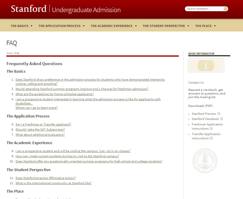
Once a visitor has found – not stumbled upon – your FAQ page, make sure the questions are accessible. Having all the questions categorized and clickable is enough to maintain a working, well-serviced FAQ. Below is an excellent example of a clickable, segmented FAQ page from Stanford University.

FAQ pages also provide designers with a unique and rarely considered opportunity. This is one section of a website destined for a Millennial makeover. Rather than simply using the same dry text to respond to questions, this is the perfect chance to utilize video. Don’t be afraid to get creative, as every short video response can also serve as another way for prospects to view campus life, career paths, or anything else your institution cares to highlight. Here’s a great example from Pomona College:

Eye Catching Student Testimonials
Testimonials should not be limited to a single, isolated page. You can easily include snippets of testimonials all across your site, allowing visitors to see the pride of students and former students alike brimming from every page. Here is a perfect way to integrate testimonials into the fabric of a website from Herzing College’s homepage banner.

From such quotes, it may be helpful to link directly to a page of testimonials in various formats: videos, text, interviews, or any innovative and engaging way imaginable. Such testimonials work best when they bolster your school’s brand and speak directly to personas’ motivations.
Make Contact and Visit Us Pages As Interactive As Possible
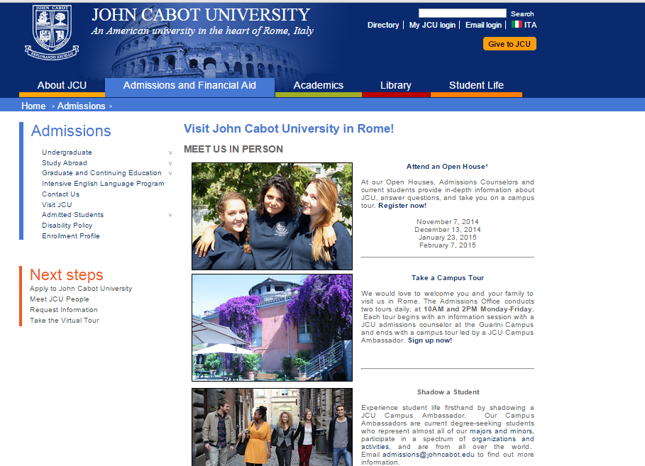
Too often, a website’s “Contact Us” page consist of nothing more than an address and a phone number. This neglects the multiple interface options such a page can offer. More often, post-secondary sites are creating “Visit Us” pages, which include not just location information but also interactive ways to get to know and understand the campus. Incorporating more recent technologies, like the ability to Skype with an admissions counsellor, also helps the page feel current. Here’s an excellent example of a visually engaging Visit Us page from John Cabot University that offers plenty of options for exploring the college:

Instagram’s Hyperlapse is also an excellent, cutting edge way to offer applicants a virtual campus tour, which along with Skype would benefit International students who are unable to attend an in-person orientation. Check out this example from the University of South Florida’s Tampa campus:

Any recent technology you can incorporate will only serve to reassure your target personas that your institution is in touch with current trends and progressively moving with the times.
Have you updated key components of your school’s website to better engage with prospective students? What innovations or technologies do you leverage to keep your website fresh and inviting?


