As the international student market continues to grow, it’s likely you’ll see more and more institutions developing multi-lingual websites. Offering alternate language versions of your site can give you a valuable advantage when it comes to attracting recruits, making the application process easier for them by presenting everything they need to know in their native tongue, and making them feel more welcomed and included in your wider school community.
Unfortunately, multi-lingual web development is rarely a simple process. A number of things have the potential to go wrong, and a quick search of the current multi-language offerings from schools on the web is still likely to reveal a whole host of errors with site architecture, translation, and design. It’s not that these sites have been developed badly or unprofessionally, it’s just that building a multi-lingual website is a massive undertaking, and it can be easy to overlook certain small factors that can undo all your good work.
If you’ve been thinking of developing a multi-lingual website to attract more international recruits, here are a few crucial things take into account before you get started.
1. Schools Need a Clearly Defined Action Plan for Their Multi-Lingual Website
Before you begin such a huge project, it’s important to have a solid plan of action in place. First, of all, your school will need to carefully consider what languages it would like to offer its website in. While offering as many languages as possible is always a plus, the process of building a multi-lingual website can take a lot of time and resources. Other elements of multi-lingual websites can be also quite problematic, and the extra care and effort involved can mean that it’s more feasible for schools to target just a few specific regions or countries at first.
In addition, depending on your school’s aims and target audience, it may not be necessary to translate absolutely every page of your site. Many schools develop smaller microsites or subdomains for international student recruitment, highlighting only relevant programs and information. Not only is this approach more efficient and cost-effective, but it can also result in a much more intuitive end user experience for international recruits, as they can easily find the information they need with getting lost navigating through irrelevant pages.
While scaling down your efforts might seem counter-intuitive, it is often the best approach in the long run. Having a small number of alternate language offerings which are presented well will make a much better impression on prospective students that vast amounts of poorly designed content, making it more likely that your multi-lingual site will actually generate more student inquiries. And provided you have well-researched and crafted target personas for your international students, a strategy that focuses on your most high potential markets can still help you make connections that count.
2. Considering Your School’s Website Layout with Multiple Languages in Mind
When you’re developing a website for more than one language, your layout should be designed with that in mind. Every element of the alternate language site needs to translatable, and needs a responsive and dynamic structure that will make this possible.
One mistake many sites still make, for instance, is using images with embedded text. Embedded text can be complicated to translate as it requires a completely new image file to be designed, and these images are often missed altogether when developers create alternate language sites. Not only does this look unprofessional, but it can make it harder for prospective students to find valuable information. An easy way to avoid this is to overlay your text onto graphics to make it easier to translate along with the rest of your content. Navigation elements, such as drop-down menus, buttons, and any other clickable elements of your site structure also need to built to translate easily.
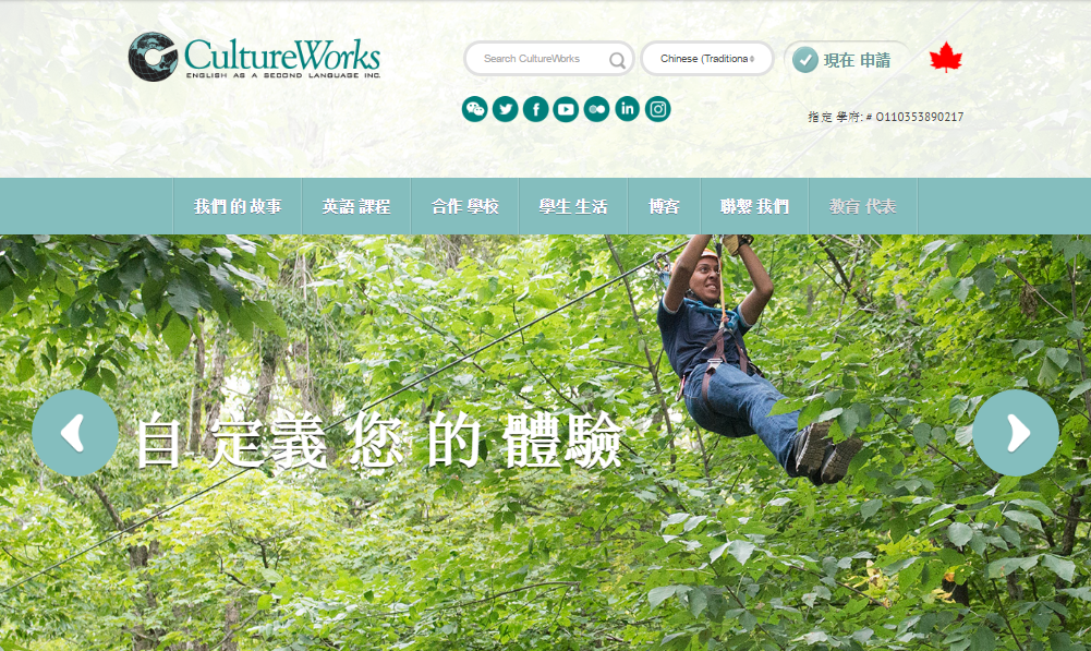
Example: CultureWorks overlay text onto the scrolling image slideshow of their homepage, making it easy to translate into alternate languages.
Another layout element that can cause problems when building multilingual websites is the size of your text, both in menu buttons and navigation bars, and in the body text of the page itself. Since different languages take up different amounts of space, it’s important to use a responsive user interface (UI) that allows different components of your page to expand and contract when necessary, and ensure the text fits correctly.
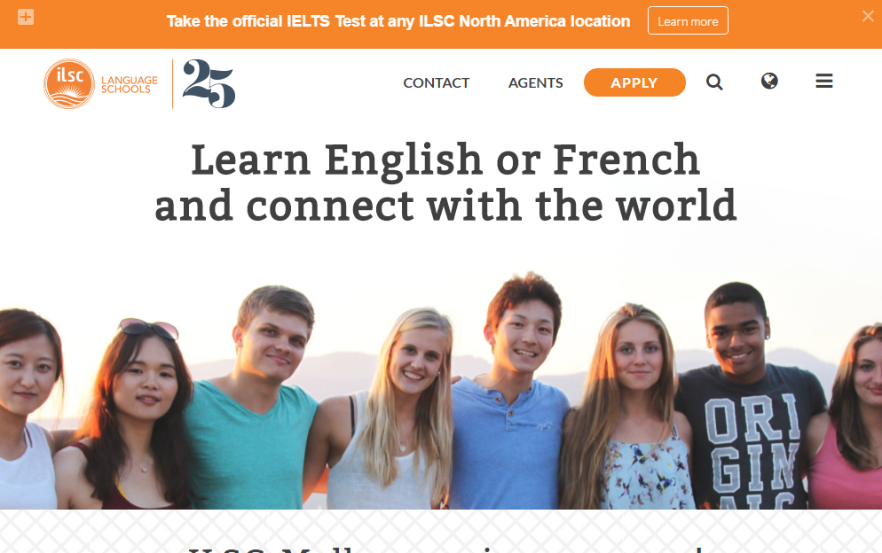
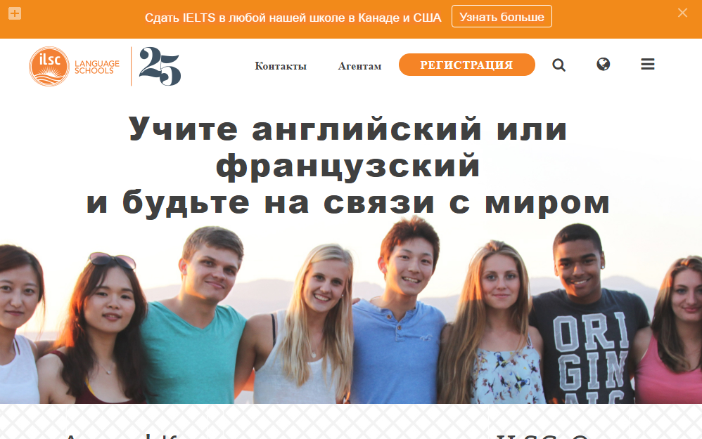
Example: Comparing the English and Russian versions of the ILSC Language Schools website, you can see that the site employs a responsive design to align its menu buttons with the size of the text.
Aside from making the layout easier to translate, it’s also important to consider the disparity of internet speeds in different countries, as that can have an impact in what elements you choose to incorporate into your web design. While internet penetration and quality is improving all the time, this snapshot from Akamai Technologies State of the Internet 2015 report shows that speed still varies greatly from country to country, sometimes with surprising results:
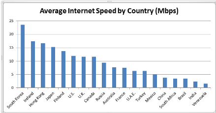
With that in mind, it’s important that your design isn’t overly complex, and will still be easy for students in your targeted countries and regions to access. For example, a school in Ireland looking to recruit in Brazil needs to keep in mind that a design that works perfectly well in their country would be much, much slower to their targeted students. While it’s natural to want your website to look as impressive as possible, you might find that, when dealing with international markets, it sometimes just isn’t practical.
3. Choosing the Right Language Selection Menu for Your School’s Website
Once you’ve finished your multi-lingual website, how will you let users choose which version of your site they see? While this might sound like a simple enough question, there are actually a number of different options schools can choose from when constructing a language navigation menu. They can be presented as a dropdown menu, or displayed as a navigation bar on your homepage if you have enough space. Another option is to use a dedicated landing page to direct users to their native language site before they arrive on your homepage.
While many websites use flags to represent different languages, it can prove problematic, particularly when using languages that are spoken throughout the world. A Spanish speaker from Latin America, for instance, might have difficulty recognising a Spanish flag. Presenting the name of each language in text- and written in that language- makes it much less confusing for the user.
Example: Destination Canada’s multi-language website features both flags and text in their language menu, making it easy for the user to find the right version of the site for them.

It’s also possible to automatically detect the language of a prospective student through their browser or the location of their IP address in order to present your site in their preferred language. This can be a useful way to highlight your alternate language website from the outset, provided you present them with an option to switch languages if they would prefer. Presenting users with the same page they were viewing when they switch languages is also important, as many multi-lingual websites redirect to the home page when languages are changed, which can be frustrating for prospective students.
4. Typography is Crucial When Translating Student Recruitment Content
The typographic layout and fonts you use for your website can make a big difference to how intuitive it is for international users. Languages such as Russian, Greek, Chinese, and countless others in Eastern Asia are all written using special characters that aren’t necessarily supported by all kinds of fonts, so you should ensure your website uses a Unicode font, which contain a wide range of different characters for different languages. You can find a useful list of those here.
In addition, it’s also important to carefully consider your font size, as certain languages need to use larger text than others to make them readable. For instance, the complexity of Chinese characters can make them difficult to see properly in a small font size.
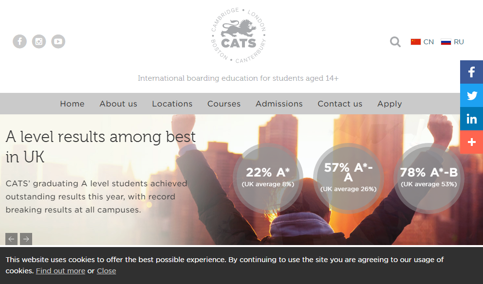
Example: Compare the English and Chinese versions of the CATS Education homepage here. While the school have made their font large enough for the Chinese characters to be readable, you can still see how much more complex the characters are when compared to Latin text.

5. Other Complications in Multi-Lingual Web Development for Schools
Certain other languages can also cause complications with your design. Thai and Lao are generally written without spaces between words, meaning schools targeting these countries need to review text carefully and add line breaks in appropriate places to ensure the text remains properly aligned and doesn’t run off the page.
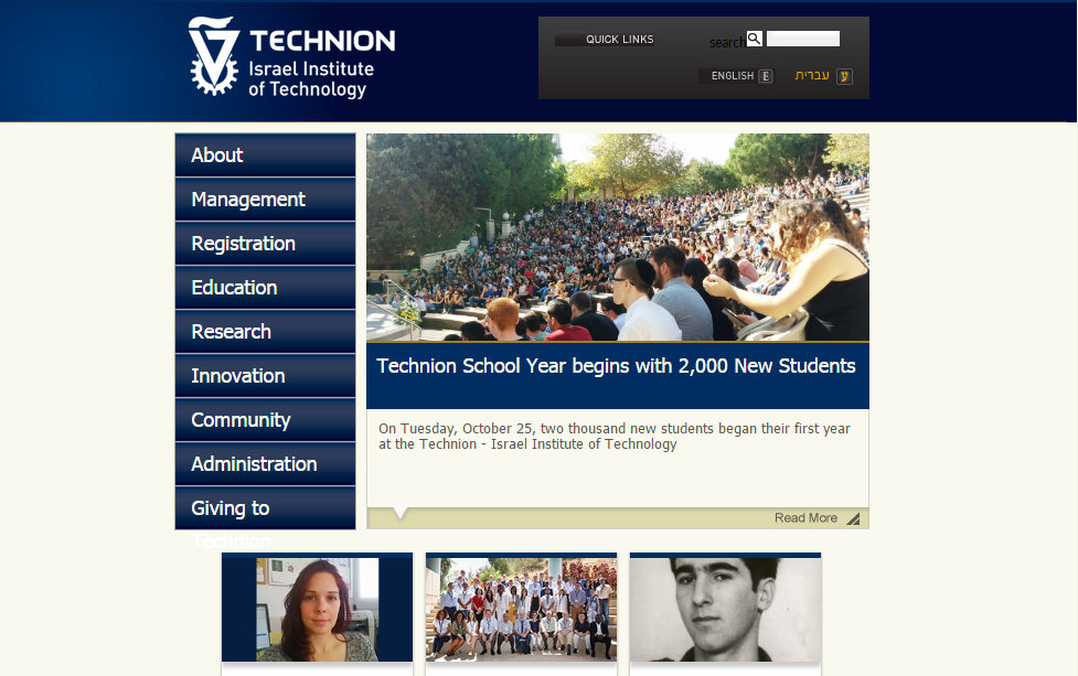
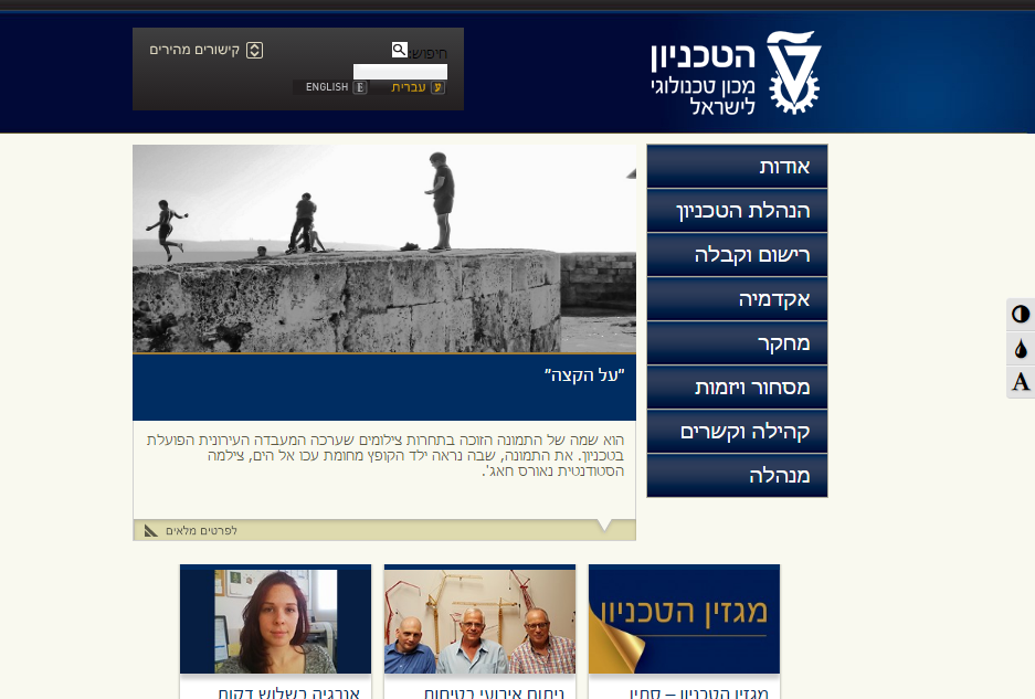
Even more difficulties can be created when developing a site in Middle Eastern languages, such as Arabic, Farsi and Hebrew, which are read from right to left rather than left to right. In this case it’s often necessary to create a mirror image version of the entire layout your site, in order to ensure the script flows correctly and make the experience more intuitive for prospective students.
Example: The Hebrew version of Technion Israel Institute of Technology’s website is presented from right to left, with the entire layout mirroring the English version.
As you can see, multi-lingual web development for schools isn’t an easy process, but there’s no reason to be discouraged. While it’s not an easy task, a well-designed multilingual website has the potential to become the cornerstone of your international student recruitment strategy, increasing your lead generation and engagement in strategically important regions and more than justifying the time and effort. And by using professional services and keeping these important factors in mind, you can ensure that the alternate language sites you create for your school avoid some the biggest potential pitfalls, and deliver multilingual offerings that make a real impact to your recruitment initiatives.
Does your school offer any multi-lingual content? What challenges has developing content in different languages presented for you? Tell us about your experiences in the comments section!


