With increasing competition, the proliferation of open online courses, and ever growing financial concerns, the college and university experience isn’t taken for granted as a life-changing rite of passage the same way as it was even ten years ago. Both career-driven students and their budget-conscious parents are increasingly digging deeper to focus on academic programs that will deliver justifiable results. For the growing number of online students, the quality of academic programs is all that really matters.
We have touched on the importance of program pages in a previous student marketing post but there is growing evidence that these can be the “make or break” sections of your website where potential students are comparing individual academic offerings before making their decision. A well designed homepage will always be important, but when academic program pages frequently receive the most visits on a site and 90.3% of Queen’s University grad students agreed that “the department’s website’s graduate program pages were the most important way for me to receive information about graduate programs,” it is time for higher ed strategy to take action.
1. Create a seamless experience
It can definitely be challenging trying to simultaneously optimize multiple program pages, but some colleges and universities that are investing time and resources on these pages are beginning to show results. The University of Manitoba recently restructured its website to provide users with consistently informative and visually dynamic content. It was a labour-intensive process to create over 100 program pages but Jeff Adams, director of student recruitment, believes providing “all of the information we can, in a simple manner,” provides users with the maximum information in a minimum of clicks. All program page information was provided by faculties and then formatted to have a common voice and style. Students are able to click to apply directly from each site.
Example: The University of Manitoba includes a program description, degree options, interesting courses and unique opportunities (co-op and exchange options), career choices, admission requirements and prerequisites, and important links for each program.
2. Make the case with relevant data
Great program pages not only provide necessary functional information but, if possible, relevant data that convinces prospects about a particular degree’s value. Career-focused students are seeking employment rates within the first year of program completion and median starting income. If you don’t have access to this data, it might be time to start collecting it.
Example: The Northern Alberta Institute of Technology makes it very clear to prospective students their ROI (Return on Investment), along with quick facts, fees, application deadlines, and a handy “apply online” button.
3. Anticipate what prospective students are asking
Prospective students will generally have a few common questions regarding a particular program and it is your task to provide the answers as clearly as possible. Questions could include:
- What is the demand for graduates of this program?
- What positions are graduates qualified to apply for?
- What have other graduates done with the degree?
- How much is it and is there financial aid?
Make it easier to finish the application process by offering immediate next steps related to enrollment on each program page. Consider that the average high-school student may have only the vaguest idea of what they want to study, so links to related majors will make navigation within your site more fluid. It is ideal to present helpful information such as a course calendar and specific benefits that result from completion of the program in an uncluttered manner, with relevant links to further details.
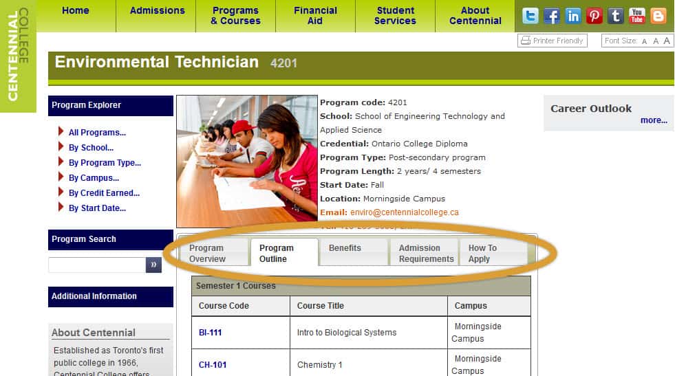
Example: Centennial College has an excellent layout on their program pages that provides a lot of content in an easily digestible format. The program overview, resulting eligibility for certification, admission requirements and application process are all tastefully presented, and a comprehensive program outline even features links to each course description.
4. Humanize with visuals and testimonials
Despite a growing focus on careers, choosing a school is still a decision about where a student can envision themselves spending a significant amount of time. Adding relevant pictures with written and video testimonials to program pages gives prospective students a better idea of the intangible feel of a place, while encouraging users to explore more of the website.
Example: Carleton University features text, pictures and videos on their main program page, while each specific program has a testimonial and sometimes a head shot to further personalize the content.
5. Optimize your program pages for SEO
Preparing each program page for search engine optimization will better your chances of targeted leads arriving there through search engines. Keep the content regularly updated while integrating the right keywords, with unique page titles and clear meta descriptions. If a major website overhaul sounds like too much to handle, try starting with five degrees or programs with the highest enrollment. Continue to test for fluid site navigation as you make updates, remembering that the easier you make it for students to understand your academic offerings, the more likely they are to apply.
What features on program pages have you found most effective for student recruitment?


