No higher education institution would dispute that their website is an important asset for all their student marketing initiatives, but this is proving more critical every day. In a 2012 E-Expectations survey of college-bound students, over half said the Web played a significant role in their decision to apply to a school, while three out of four emphasized simplicity in navigation and content over flashy features. Most prospective students are likely to visit your website via search engines, from which they can directly access the pages that matter most to them, namely the admissions pages.
While homepages tend to gain the most attention from web designers, a 2013 Lipman Hearne report showed that nearly as many prospective students visited a college’s admissions page (58%) as the homepage (63%). Making student recruitment a top priority means featuring “Admissions” prominently on your homepage and preferably on a fixed navigation bar so it can be accessed within a maximum of two clicks from anywhere on the site. Better admissions pages engage prospects by efficiently providing the answers they came for while effectively embodying the school’s brand.
1. Simplify
Recent statistics confirm that the attention span of web users is constantly shrinking and people are actually more likely to read the same amount or more on pages with fewer words. Considering that the principle target audience is high school students, simplicity of navigation, copywriting and overall content presentation should be job one. This can be challenging when there is extensive information to convey to various audiences (high school students, parents, international and transfer students, etc.), but clever design strategieseliminate redundancies to focus content into brief sections, rich in keyword links to further details, and often color-coded for easier navigation.
Example: University of Alberta‘s “How to Apply” section gives 3 clear options with pictures and plenty of white space, and the colour-coded Admission Steps expand with a click to provide only the most necessary information, linked to source data. It gives prospective students an uncluttered path to the answers they’re seeking, with large “Apply Now” and “Visit Campus” call-to-actions prominently displayed.

 2. Be true to your school
The best admissions pages inform while reinforcing the institutional brand. What are your distinctive selling points? You want to find an engaging way to condense the key value propositions of your college or university’s quality and spirit in an easily digestible package. Translating educational values and complex academic programs into clear, relatable messages is not an easy task but try to consider the points that really matter to students and present them in a visually captivating format, like these infographics from the recently redesigned Duke University website.

Based on your core branding foundation, use various imagery to show, not just tell, your story. Go beyond generic taglines to create high impact statements that speak to the special qualities of your college. Many prospects are seeking a school where they can imagine fitting in, forging lifelong friendships while learning in a stimulating environment. Tastefully infuse your web pages with your college’s spirit that inspires as it informs.
Example: Dalhousie University does a great job of providing the information prospects are looking for while giving enough of a glimpse of campus life to encourage excitement and engagement.
 3. Revisit your page from a prospect’s perspective
Too many higher ed websites are cluttered with excessive data that has built up over the years. Colleges can catalyze a prospect’s decision-making process by delivering the streamlined, uncomplicated yet powerful user experiences they are drawn to elsewhere on the web. Capture the attention of a teenaged audience with easily understandable key content, student stories, strong imagery and videos. Ensure that you answer their top questions (admission standards, financial matters, applicable majors, etc.) in an interesting, intuitive way. The choice of photography, typography and layout all factor into how engaging a page is.
Example: Washington State University‘s admissions page immediately responds to the interests and concerns of high school students with its Instagram feel that also looks good on a phone.

Example: York University conveniently colour codes their subject tabs from a prospect’s perspective, providing fundamental information in a minimum of link-enhanced words and large, bright call-to-action buttons.
 4. Go mobile friendly
While it is becoming easier to find better mobile solutions for enrollment and admissions, many schools still lack mobile-friendly admissions applications. With approximately one-third of admissions website traffic estimated to be mobile, this is an issue warranting greater attention. Offering a mobile-optimized site or admissions application makes it easier for this significant (and growing) segment of the population to apply. Include core elements in your mobile communication, including:
- Application deadlines, required documentation, links
- Campus tour sign-ups, directions, maps, accommodation
- Relevant introductory details, majors, academic paths, quick facts
5. Optimize your analytics
Analytics in higher education is the best measure of your admission page’s effectiveness. Google Analytics is a free service that can be used to define goals for particular actions on your website, such as confirming admission, applying for admission, and inquiring. This is an excellent tool for revealing the conversion path length and time lag to identify prospective student behaviors at key points in the decision making process.
Find the admissions pages most frequently visited in the past 6 months by noting the 6 alternate entry points from a Google search of your school, and select the highest for weekly tracking. Filter out internal site users so that tracking reports are only based on new visitors. The “bounce rate” will tell you what percent of visitors leave a given page without moving on to another, alerting you of potentially ineffective web pages.
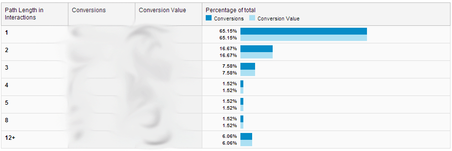
Example: These results from U of Admissions Marketing show that over 90 percent of recruits inquire within the first three interactions, and 86 percent within the first three days. This proves that first interactions are critical for encouraging inquiries and that your information request form should be easy to access.

Providing the right answers on your admissions pages that speak directly to prospective students will go a long way to converting curious website visitors into those that click “Apply.”
What strategies have you found most effective with your admissions pages?


