With over half of search traffic coming from mobile devices, it’s surprising that many schools have not created a truly mobile-friendly version of their website.
After all, in today’s mobile-dominant world, it’s arguably just as important that your site is compatible with phones as with computers. This includes having legible text, clickable CTAs, and website content that is intuitively organized to fit a 5-inch screen.
Now, you may be thinking: my website is responsive—isn’t that enough? Well, it may have been a couple of years ago, but today’s mobile users have even higher expectations for mobile site design and usability.
Read on to discover the features your school’s mobile site should have if you want to improve usability, boost your school’s brand, and convert more leads.

1. Mobile Education Websites Should Always Have an Eye-Catching Homepage
The moment a prospect lands on your homepage, they will begin forming opinions about your school. A mobile website with eye-catching visuals and a slick design will position your school as modern, innovative, and the kind that will prepare its students for today’s market. As for a website with an outdated design, well, it will probably do your school more harm than good.
If you’re thinking that your desktop site is sufficiently attractive, make sure your mobile site meets the mark as well. Many schools assume that the visual appeal of their desktop site will automatically transfer to their mobile site, but this is not always the case.
For instance, many well-designed websites feature a striking hero image on their homepage. Usually this hero image is horizontal, and occupies the entirety of the desktop screen. The mobile surface, however, is vertical, which means that the hero image will take a small portion of the screen. If there is text on the hero image, it likely won’t be legible in this format.
As a result, your school may want to create an entirely new homepage for its mobile site in order to create the best possible first impression on its prospective students.
Example: NYU Tandon has optimized the story blocks on its mobile homepage to occupy the better part of a user’s mobile screen. Not only is this format visually striking—it also makes the homepage easier to navigate, and the text easier to read.

Each element of your mobile homepage should work together to convey the message your school wants to communicate. While colours and general branding will automatically be replicated on your mobile site, other elements won’t. The images you include and where you place them, as well as the use of white space on your site, may need to be reconsidered for mobile devices.
Prioritization is key when it comes to your school’s homepage, as well as any other elements—like a sticky header—which will follow a user even after they navigate to other pages.
Winning mobile-friendly websites prioritize information that plays a key role in a student’s understanding of your school, such as program and course info, as well as conversion elements such as CTAs and forms.
2. Responsive Website Design is Critical for Education Websites
Not only are prospective students visiting your website using a variety of devices with different screen sizes, there are also repeat visitors returning to your site on multiple devices. As a result, it is crucial that your education website provides the same experience no matter what device someone uses to access it.
Responsive design is responsible for ensuring that happens. This web design approach rearranges web elements depending on the size of screen someone has. For instance, if a web page had four elements lined up horizontally, they may be stacked vertically on a tablet or mobile device.
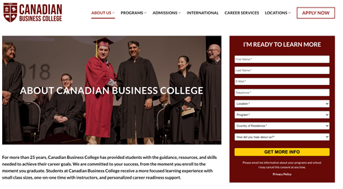
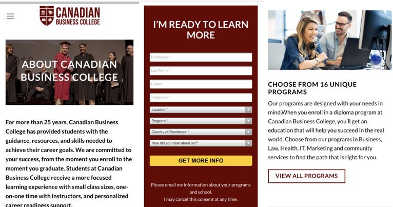
Example: Canadian Business College’s “About Us” page on desktop and mobile. As you can see, each element on the desktop version is broken up and arranged consecutively for easy scrolling.

Desktop

Mobile
However, it’s important to go beyond just responsive design when creating a mobile-friendly website. Just because elements adapt to fit a phone screen doesn’t mean they will automatically be optimally arranged, just as we discussed with the homepage hero image.
For instance, a website with a responsive design structure will automatically include all web elements (that means menu items, images, CTAs, you name it) on the mobile version. However, it’s likely that you want to customize as well as prioritize these different elements for mobile devices, which requires special attention to your mobile site.
4. Ensure Your Higher Education Website Offers Simple Mobile Navigation
Practically all higher education websites have some sort of central navigation, which tends to be located in the header. Often, the menu items open up a dropdown menu of even more items. While this is an intuitive navigation structure for a desktop site, all these buttons and menus can cause confusion and navigation issues on mobile devices.
To optimize your menus for mobile, the first step is simplification. Are there any opportunities for your school to condense its menu items? You could, for instance, group articles together into a dropdown menu, as the below example shows.
Example: The menu section of Medix College’s mobile site. The menu opens in a separate popup, where all the web pages are conveniently organized under 5 different categories.

The next step is deciding how to organize your menus. If you only have a couple of categories within which your pages are stored, you may be able to include the menu buttons on your website header.
However, for many websites, this is not the case. If schools were to use their desktop navigation structure on mobile, the menu would either take up the better part of the screen—thereby making it difficult to view the actual website content—or the individual menu item buttons would be too small to accurately click.
As a result, many schools instead include a hamburger menu on their header, which, when clicked, opens up the full menu in a separate page or a large popup.
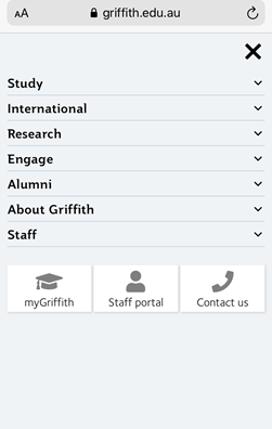
Example: The hamburger menu on Griffith English Language Institute’s mobile site opens the following menu on a page-length screen. This provides adequate space between the different elements, making it much easier for prospective students to browse through your site. You can also easily click out of the menu to continue navigating the school’s website.

5. All CTAs and Forms Should Be Optimized for Your School’s Mobile Website
Having a well-designed, easy to navigate mobile website is crucial for creating a positive first impression on your prospective students. But if you want those prospects to go from intrigued to enrolled, you need to ensure that your mobile website is optimized for conversions.
In other words, you need to get your calls to action (CTAs) and forms in check. These little elements have a large responsibility in moving prospects through the enrollment journey, whether that be connecting with an admissions advisor, booking a virtual tour, or generating a quote.
CTAs, in particular, help prospective students understand what actions you want them to take on a particular page. This could be visiting other pages on your site, filling out a form, or accessing your school’s application portal.
While it can be easy to get carried away with CTA use on your desktop site given the relatively small space they take up on the screen, it’s a different story on mobile. Not only is there less space, you have to remember that all clickable elements must be big enough to click on a touch-screen phone.
Web design experts recommend ensuring that mobile CTAs are around 44 x 44 pixels. If you have multiple CTAs in one area, make sure there is enough white space between them in order to prevent misclicks.
To account for the limited space for CTAs, you may want to consider adding one to your sticky header. This way, prospects will be invited to complete important actions no matter what page they’re on, or where they are on a page.
Example: Cumberland College’s mobile site with a sticky header that includes two prominent calls to action.

Forms can also pose problems on many mobile sites. The phone keyboard takes up a significant portion of your screen space on many devices which makes it difficult to fill in short answer questions and move between fields. Dropdown fields, if not optimized for mobile, can be difficult to navigate on cell phones as well.
While some of these issues—such as the size of a mobile keyboard—are out of your school’s control, there are many ways you can optimize mobile forms to be as easy to fill out as possible. While having an all-round mobile friendly website should be of utmost importance in your digital marketing strategy, having mobile-friendly forms is arguably one of the most important elements of this process.
The first thing to do is look over your forms to see if there are any areas you can trim down. If there are any fields you realize aren’t relevant or essential, nix them. You may also be able to change short answer fields to check boxes or dropdown menus in order to make it quicker for mobile leads to fill out forms.
Consider, also, which form fields are required. For instance, many forms have a space for prospects to leave questions and comments. It may be beneficial to make this form optional, as it may be tedious for prospects to list out their questions on their phone.
Forms should also take up the width of a standard mobile device so that users can easily click on them. Issues can be caused if prospective students have to zoom in on the form each time they want to fill out a form field.
Example: An inquiry form on Griffith College’s mobile site which is clean, simple, and easy to navigate.

It is also a good idea to include CTAs on your mobile site that direct users to your forms. Just because you know that there will likely be an inquiry form on a “Contact” or “About Us” page doesn’t mean your prospects necessarily will.
Also, consider the fact that when you land on a desktop site, you can usually see a significant portion of the page elements, which is not the case for mobile. It may take a lot of scrolling to stumble upon a form, but a CTA ensures that these key conversion elements are front and center.
Example: The sticky “Contact Us” CTA on ILSC Language Schools website links to the inquiry form on their “Contact Us” page.

When optimizing their education websites, many schools will prioritize the most obvious elements, like the visuals and overall functionality. Now, of course, we’re not saying that these elements aren’t important. As we mentioned, user experience helps form a mobile visitor’s first impression of your site. But it can be easy to think your work is done once everything appears fine.
However, forms and CTAs are key conversion elements. So if your site just looks good, it’ll do a great job at impressing visitors, but not inviting them to engage with your school, thereby chopping your funnel in half.
6. Quick Loading Times are Essential for Higher Education Websites
Here’s a digital marketing conundrum for you: the average mobile web page takes 15.3 seconds to load; however 53% of website visits are abandoned if the site takes over 3 seconds to load.
The statistics make it clear that many websites are struggling with their loading times, which could be costing them new customers—or, in the case of schools, potential students.
It is imperative that your higher education website loads immediately if you want those who click on your site to actually stick around.
If you want to find out how your website’s speed fares, there are a few different ways to check.
In a pinch, you can use Google PageSpeed Insights to test how different pages on your website load. All you have to do is enter the URL.
Example: Google PageSpeed Insights report from a sample website. This report analyzes a number of important page speed factors and lists the major issues influencing your school. The report may appear highly technical at first glance, but if you click each element, you can find an explanation of what the numbers mean.

It’s imperative that your school’s mobile site loads immediately, as mobile users do not wait around for a slow site. Page loading speed is also very important to your search engine rankings.
There are many ways to speed up the loading time of your site, including reducing the size of images, using reliable plugins, reducing the amount of extra content on your site, and using AMP (Accelerated Mobile Page) protocols. Even improving the speed of your site by seconds can make a major difference to mobile visitors.
While the Google PageSpeed Insights test provides insights into the general health of your mobile site, you may also want to assess whether or not there are any particular pages that are causing issues for those using mobile devices.
Google Analytics is your best friend for this endeavor. Under Behavior, you can find the “Page Timings” report which shows the loading speed of each of your webpages compared to your site average.
By default, the report will show you the page loading times across all devices. To narrow down the data, add a secondary dimension for mobile devices.
Example: The “Page Timings” report in GA. We’ve highlighted the area where you can add a secondary dimension, as well as the data you should be paying attention to. This report can help schools prioritize which mobile pages they want to optimize based on how much traffic these pages get, and how poorly they load on mobile devices.

Fixing technical issues on your mobile website will not improve your site’s usability—these changes will also reflect positively on your school’s brand. Just as students want a program that doesn’t only look appealing on the surface, but has the curriculum and accreditation to back it up, your website shouldn’t only look impressive: the technical elements must also be in check in order to provide the most value to prospective students.


