This post is focused on how to create more effective lead generation forms. Lead generation forms appear on custom landing pages but are also embedded within content pages, home pages and contact pages. More and more higher ed institutions are adopting the practice of using them on high level home pages and program specific recruitment pages. This has been a common practice on the for-profit side of higher ed for a long time but now more public institutions are applying them in the very serious business of internal site managed lead production.
Here are a few tips to help you improve the effectiveness of your lead forms:
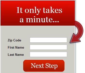
1. Keep your Forms Simple and Open – One of the simplest rules of good form design is to keep them simple, and let the fields “breathe”. This allows the page visitor to “digest” the page and make an easy choice to engage with it. Here is a good example below. Complex, dynamic, or overdone forms often over-stimulate the visitor and in those few thousands of a second you have their attention, they may choose to move on, simply because it is too complicated to stop and try to figure it out.

2. Keep the Number of Fields Down – The research is pretty clear on this. The fewer fields you ask a prospect to fill in, generally the more leads you will get. But at the same time, the more information you get from a prospect allows you to follow-up more effectively and generally convert at a higher rate. This is the Catch 22 of lead forms that you have to resolve. I say go with as few fields as you can, with name, email and phone number as the key fields. Zip-code is a good fourth to get more location detail without having to ask a prospect for street, city, province/state, country. With the right back end software running you can extract the location details from the postal code/zip. Whether to include phone number can be a difficult call. Having it included in the form can reduce your conversion rate as much as 5% but conversely, if you can follow-up immediately with a phone call to the prospect, conversion rates to student improves dramatically.

3. Use Value – Based Buttons – The text on the form submit button needs to express what the button will do when it’s clicked. “Get information”, “Book your Visit” , “Get our View Book” are all examples of good value based button text, that provide relevant and non-intimidating outcomes that have value to the prospect. Spend some time thinking about this text, as it has been shown that the default use of “Submit” can reduce your conversion rates by as much as 3%.
![]()
![]()
![]()
![]()
![]() 4. Include a Privacy Policy – Always include a statement that tells prospects that their info will be protected. Including a link to your privacy policy is even better. As you know, students are very reluctant these days about providing their true contact info to recruitment offices, so every little bit of trust you can engender helps to engage and draw a prospect into your recruitment funnel.
4. Include a Privacy Policy – Always include a statement that tells prospects that their info will be protected. Including a link to your privacy policy is even better. As you know, students are very reluctant these days about providing their true contact info to recruitment offices, so every little bit of trust you can engender helps to engage and draw a prospect into your recruitment funnel.
5. Data Verification – I really don’t like to use Captcha forms to ensure that there are humans at the other end of a lead request. I think they are awkward and rather ugly and the research shows that they can have a negative impact on your conversion rate. If you are having a problem with robots spamming your forms, as I have lately, you have to make the choice between volume of leads vs quality.“Smart” Captcha offers a bit more finesse, appearing only after a second attempt to fill you form coming from the same IP address.
6. Always Position Your Forms Above the Fold – It is always surprising to me when I see lead gen forms below the fold , (the portions of a webpage that are visible without scrolling). If a particular page is the right page for the form then it deserves to be above the fold where it can be seen on first glance, rather than in the middle or bottom of the page, where few visitors ever actually see it.
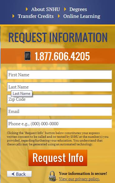
7. Test , Test and Test – Lead generation forms are very unpredictable elements with respect to their performance. I would love to be able to say that there are 10 best practices that always work for everyone to improve your form conversions but it just does not work that way. To determine what works best for you, you have to do some real testing. Google Analytics Experiments is a great tool for A/B testing your forms but there are also a number of really great multivariate testing tools available () out there for the more adventurous. You have to learn what works for your programs and then keep testing on an ongoing basis to keep improving your results. Here is an example of two forms that I encountered on the Southern New Hampshire University site while researching this post that are likely part of a multivariate test. In multivariate tests a larger number of elements of the form are interchanged to determine the best mix for optimal conversion rate.


The structure, content and copy of your lead generation forms are critical to your lead generation efforts. Apply the basics first and then expand your knowledge through form testing. These tips can help you to manage the volume, quality and overall ROI of your leads.
Good luck and let us know what you’ve learned from your experience. What approach has worked best on your forms? Do you use any data verification techniques? What is your most effective button copy?


