
Your program pages are hot destinations for students and parents during the enrollment decision making process. Whether they’re considering language training, an undergraduate degree, Master’s program, or a vocational diploma – students visit program pages to discover how your school can help them succeed.
Some experts claim that visitors form conclusions about a web page 7 seconds after they land on it, while others insist the interval is much shorter – a matter of mere milliseconds!
The point is, your program pages have a lot to accomplish in a VERY small window of time.
An incomplete, hard to read, or otherwise lacklustre program page could be a significant roadblock on the road to conversion. On the other hand, an engaging, thorough, persuasive program page might be the door through which your school welcomes its next round of applicants.
Follow these tips to ensure that your pages truly reflect your academic brand, and have what it takes to impress an increasingly discerning audience.
Usability: Easy Reading & Intuitive Navigation
Your program pages might be chock full of relevant information about what students will learn and how – but if that information is buried in a sea of text, with no titles or quick links to guide navigation, it’s unlikely that visitors will stick around long enough to discover just how much you have to offer.
If you know your personas (essential for effective inbound student marketing), you should consider how they would most like to explore your programs. What questions do they typically have? What are their motivations for enrollment? And it’s simply best practice to ensure that such important pages are easy to navigate and explore. A few must-haves for usability include:
- quick links for easy navigation to relevant program information
- clear, good-sized print that can be read with ease
- intuitively organized sub-sections that anticipate your personas’ questions and concerns
Sheridan College helps prospective students find what they need quickly by offering quick links to pertinent program information on their Bachelor of Game Design page, just below the banner image. There’s no need to scroll down the length of the page to locate these sections, so visitors can make a beeline for the topics they’re most interested in:

Sheridan also highlights application links for both local and international students on the right hand side bar, along with nicely categorized details about the program. The page has been designed with target personas in mind, making it easy to find what’s needed to take that next step.
New Zealand’s University of Canterbury also anticipated the questions and concerns of the program persona when designing their Bachelor of Education page. The information is divided into sections, each one addressing a question prospective students would ask:
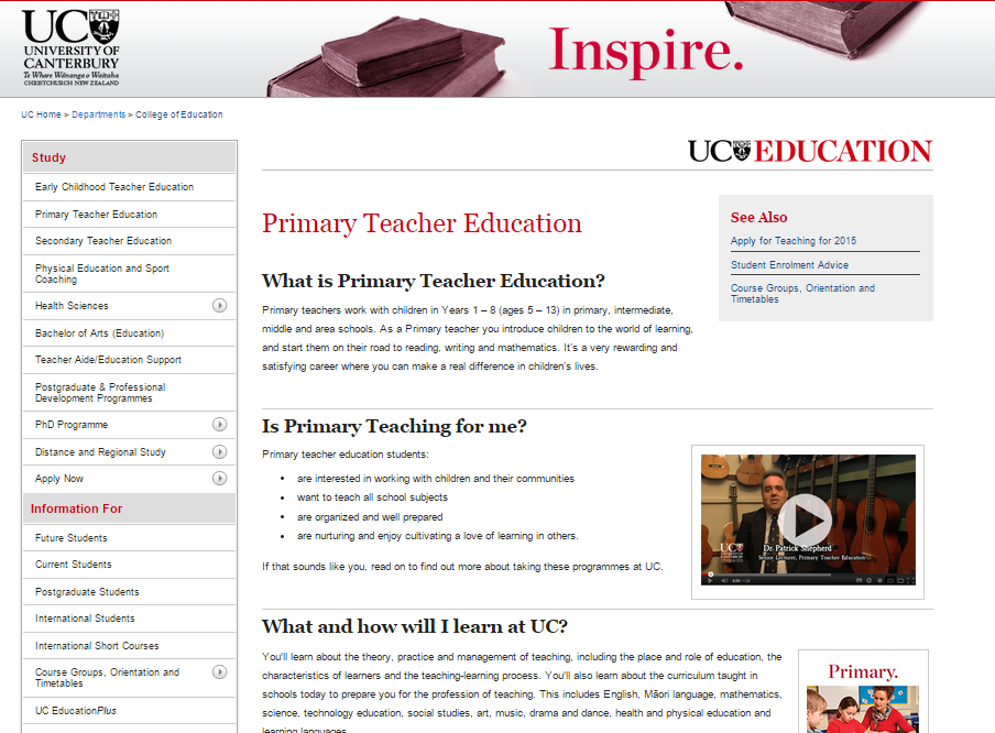
Double spacing and nicely-sized text mean the page doesn’t feel crowded with ink, and the reader can easily scan each question and answer. This is an FAQ-style approach that works really well to resolve prospective students’ doubts or concerns regarding whether the program – and the school – is the right fit for them. It also serves to chunk information, rather than hitting page visitors with a solid wall of text, which generally sends them packing.
Visual Engagement: Context & Community
Given its ever-rising influence online, visually stimulating content should play an important part in your school’s digital student recruitment initiatives – including program pages. There are a wide range of images and videos marketing and admissions teams can add to these pages, including:
- instructor interviews
- video FAQs by current students
- video tour of the facilities
- images of students on campus, in classrooms, completing projects, and participating in program-related events
Visuals like these help keep visitors engaged while carrying out the incredibly important job of contextualizing your academic program or training course. They function as a window into your learning community, inviting prospective students to imagine themselves joining in and achieving their goals.
The London School of Economics has a nice collection of visually engaging options on the left hand side of its program page for International Relations, Government and Society:

These videos bring the program to life. They go beyond academics to offer a glimpse of the city, and the chance to meet current students and alumni. They’re much more likely to spark interest and inquiry than traditional textual descriptions.
In this next example from the Academy of Applied Pharmaceutical Sciences (AAPS), the program page offers a video tour of facilities (very important when making claims about state-of-art training labs), an introduction to faculty, and links to program related blog posts. All of these elements combine to offer site visitors:
- insight into where they will be training
- confidence that they will learn from industry experts
- trending news and information designed to capture their interest and inspire inquiries

The University of Western Ontario puts the focus on community right from the start with their welcome page for aspiring Philosophy students. The page introduces site visitors to faculty members, integrates News and Events feeds, and uses a slider to feature persuasive content – such as the success of program alumni:

A visually engaging program page functions like a portal to a new world. Images, videos and prominently displayed news help to define the contours of that world, enticing visitors to take those next exploratory steps.
Conversion: CTAs, Forms & Next Steps
Let’s say your institution’s program pages have already fulfilled the requirements we’ve outlined here so far. They are intuitively designed, visually engaging, and provide visitors with a robust sense of context. But how are you doing for Calls-to-Action or prompts for next steps?
As much as the program page is meant to be inspirational and informational, it should also function effectively as a funnel. Structures should be in place to transform that spark of excitement into new leads for nurturing campaigns, and applications for enrollment.
Well-crafted CTAs, Request Information forms and promotional offers are absolutely essential elements of any successful program page.
Take a look at how The National Academy of Health and Business (NAHB) combines an effective Request Info form with a persuasive list of reasons to choose the career college Accounting program. The Why Choose Us section helps to resolve doubts while prompting next steps – i.e., to fill out the form. It’s a powerful pairing:

In this next example from Leiden University, the page title itself is a Call-to-Action! Prospective students are invited to “Discover International Studies,” and after a brief program description, are urged to “come visit us” with plenty of next steps – there are offers to sign up for open house, spend a day at the university, or chat with admissions via Skype. Meanwhile, a student testimonial and links to social media provide a persuasive push toward membership in the program:

Stenberg College also does a great job of combing CTAs with persuasive evidence of student success. Their practical nursing program page makes it hard for visitors to resist requesting more information:

Stenberg clearly knows their persona and uses this page to speak directly to their interests, training goals and the anticipated benefits of completing this diploma program. Each part of the page is dedicated to helping prospective students find the information – and the inspiration – they need to take those crucial next steps.
And so usability, visual engagement, effective contextualization, and relevant next steps combine to generate the ultimate academic program page – a place where information leads to inspiration, and community leads to conversion.
What’s on your program pages? What types of content, forms and CTAs have you found to be most compelling and persuasive?


