The educational world is relentlessly competitive, making it more important than ever for schools to pursue every avenue possible for boosting enrollments. In that regard, international prospects have increasingly become a key area of recruitment for schools. While COVID initially caused disruptions to that trend, the good news is that international enrollments have begun to make a rebound in recent months. This upswing has been observed in line with rising vaccination rates in populations and a generalized improvement to safety measures and protocols, resurrecting the appeal of studying abroad!
To take advantage of this favourable shift and capture the attention of international students and their parents researching schools online, schools need to create targeted campaigns and craft effective online resources for the job. One of the most important tools to that end is the landing page, carefully constructed for conversions. All landing pages should follow a general set of best practices to be effective – but there are a few additional factors you should consider when devising these pages with your international prospects in mind. We share the details here!

Know Your School’s Market: Overview of the Current International Student Landscape
A recent report from ICEF Monitor was encouraging, pointing to an anticipated “strong international enrollment recovery” for the 2021/2022 school year – yet schools from English-speaking nations shouldn’t assume they’ll attract prospects from the same markets they did pre-COVID. The pandemic has changed a lot in the educational competitive field, leading to surges in enrollments in other parts of the world. As an example, China has become a leading country for international enrollments, attracting an ever-growing number of students from Asia and Africa – regions more traditionally known for choosing higher education institutions in Western nations. With these market evolutions, the key for schools looking to bolster their international student recruitment strategy is doing a little research to know which regions to target.
Example: One recent study demonstrated that while there’s been a downturn in international students from China and India enrolling in U.S. colleges (as those nations have taken a more localized approach to education in response to the pandemic), we’ve also seen a 4% increase from European nations enrolling there. The graphic below demonstrates the upswing in enrollments from Europe versus the downturn from other parts of the world:
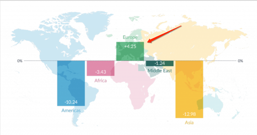
The increase in European enrollments at US schools is being attributed to a combination of factors, including Brexit and the recent introduction of test-optional policies at many US schools, brought about by the pandemic.
With markets and the competitive landscape quickly evolving across the globe, schools that want to get ahead will need to re-think their international student recruitment strategy, doing whatever it takes to make their offer more alluring than that of competitors.
Ideally, your international prospects would already have heard about your school, landing on your website to do their research after they have searched for you on Google. The reality is that most schools have to work to get their names out there. Even those with great repute need to work at it to keep their course offerings at a higher level of value and appeal to those offered by competitors.
So How Can You Capture Students Researching Schools Online?
Attracting international prospects effectively requires a multi-channel approach, combining paid advertising, blog content, email marketing, and social media messaging for attaining the widest possible reach. A click on a link included in one of these channels will ultimately lead to the landing pages that you have carefully designed with student recruits in mind.
Example: A Google ad based on a search for a “data analytics course in Toronto” leads to an ad, which then leads to this landing page from the Rotman School of Management, where the prospective international student discovers the call to action to download a brochure. The school can collect leads this way. Note how the lead form includes “country/region” to help the school gain an understanding of regions responding the most to the landing page.

Google ads like the one that led to this landing page are a great place to start off your international recruitment strategies, with targeting largely based on the keywords your prospects will be using when searching for a study abroad course, program, or school of interest. An advantage of Google ads is that you can customize your ads to the audience you want to reach by using keywords that you’ve identified as high-value, serving as an effective tool for reaching prospects in specific regions.
The success of your landing page will be determined in equal parts by the international student recruitment strategies you use to draw your prospects to it and the way that you create this carefully designed asset.
Some Landing Page Best Practices for Your School to Consider
Landing pages are key in all your marketing strategies because they improve conversion rates by directing users very clearly towards a single destination. They also help to provide context to your offer, with compelling copy that communicates exactly why a prospect will benefit from filling out the form. For your school’s internationally-focused landing pages to be as effective as they can be, you’ll want to follow a few simple best practices applicable to all landing page designs for achieving higher conversions:
Include Calls to Action (CTAs)
You will need to identify your offering and decide on what your calls to action (CTAs) should be. Some common examples include “Download our brochure now,” “Click here for more information,” “Find out more,” etc. You will also need to determine what action you would like the user to take. This could include scheduling a campus visit, requesting more information, or finding out more about your programs. Once you identify what your CTA should say, you need to make sure it stands out on the page. Using contrasting colours and brief text helps attract a visitor’s attention.
Example: In this landing page from the Toronto Film School, note the use of the “Get More Info” CTA, which continually appears as the visitor scrolls down the landing page to learn more program details. It’s also easy to spot, appearing in red against the black background of the page.

As a rule of thumb, try to steer away from adding more than one to three CTAs on the landing page as too many CTAs can be confusing or off-putting to your prospects, and may ultimately persuade visitors to leave the page before taking action.
Use Captivating Visuals
Just as eye-catching visuals are essential for capturing the attention of an audience through paid ads, imagery is also an effective way of grabbing and holding the attention of your prospects on your landing pages.
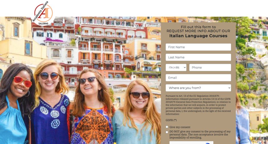
Example: This picture on Accademia Italiana’s landing page is captivating enough to fill the whole background, showing international prospects the vibrant setting and social experience they can expect by taking Italian language courses in Italy.
Video is also an excellent option for making your landing pages more engaging. International students are eager to know as much as they can about the country of study they’re considering, and no other medium will help you tell your school’s story better. You’ll have to consider one disadvantage, though – the fact that the majority of videos included in landing pages will be in the form of an embedded YouTube link, which draws your prospects away from your page momentarily. Still, the option for including such compelling content about your school such as a campus tour or testimonials from current international students makes video a great bet for making an impact with your international prospects.
Example: This testimonial video from the University of Exeter would be great to include in a landing page, as it showcases students from all over the world sharing their favourite aspects of studying in the UK city.

Emphasizing the highlights of the country or city of study can be almost as important for appealing to international students as touting the best features of your school. If you’ve already created compelling video content about your school, try using it in your landing pages to see if it makes a difference to your conversions.
Present a Clear Offer to Draw Prospects to Your Lead Form
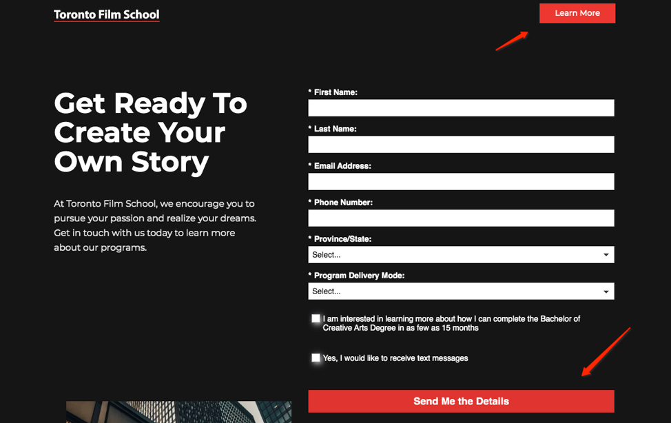
Your landing pages are all about collecting lead information from the prospective students who land there. To that end, it will be essential to draw them into an easily found lead form that allows you to collect those details. Offers included on school landing pages to entice prospects to fill out the form will often be about providing “more information” or details about one of your programs, as seen here on another landing page from the Toronto Film School:
To further motivate your prospects to provide their contact details, you might try producing an even more alluring offer, such as a brochure about campus life, a checklist for getting ready to go back to school, a sign up for a free Webinar, or a free subscription to a newsletter.
For best results, be sure that your CTAs and forms point to a variety of offers that are suitable for every stage of the enrollment journey. A prospect in the awareness stage, for instance, might be more inclined to sign up for a newsletter or mailing list rather than make a direct inquiry or attend an event – which are more likely to be consideration stage actions. You’ll also need a clear path for those further down the funnel to apply.
Keep Messaging Clear and Concise
This is a best practice on all landing pages, but it’s even more important when creating the messaging for international students to ensure they’re not put off by too many words, complex sentences, or colloquialisms they can’t understand with a basic level of English.
How to Design Landing Pages with International Prospects in Mind
When designing any landing page, your school will be keeping a specified audience in mind based on your course offerings. In designing these pages with international student recruitment in mind, you’ll need to segment this further according to the international demographics you’ll be targeting.
Create International Student Personas
You’ll need to know which global markets to zero in on, with an understanding of which countries are most likely to be attracted to your school’s courses and programs. Beyond keeping up with news on evolving markets in the education field, your research into who’s making the most inquiries to your school might come from the analytics of your social channels. It may also come from your school’s Customer Relationship Management (CRM) database if you have this tool at your disposal. Your school can also simply turn to its most recent applications to see which foreign countries are showing the most interest. From there, it will be helpful to start developing specified student personas to target.
Example: HEM developed a range of student personas for a language school in Spain, with one of them spotlighted below.
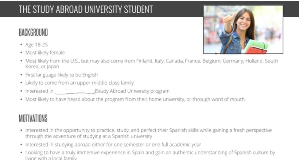
Personas can help you to fine-tune the messaging you create for your international students, as they allow you to envision not only the demographic information about the student and their parents – but also the motivations and concerns the prospects will have surrounding studying abroad.
Create Messaging that Speaks to the Needs of Your Personas
International students and their parents are interested in knowing that your school will be welcoming and that you have health, safety, and general best interests in mind. You can let them know you understand their specific needs and concerns by designing your messaging accordingly.
Many schools will attempt to address international student questions by having a dedicated section on their website like this one from Oxford College in Ontario, Canada:
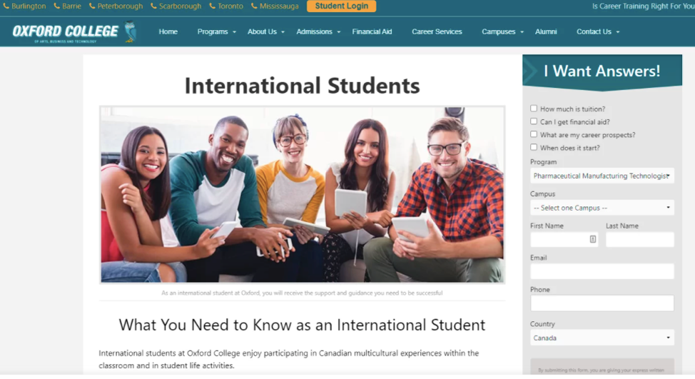
Dedicated sections like this are clearly beneficial to international prospects, but the challenge is that students have to find your website before arriving at this section. Many of your prospects will not find you as a result of landing by chance on your website, but rather by clicking the links you’ve included in your email campaigns, blog posts, social media posts, and paid ads. With these campaigns in mind, you’ll want to ensure that what they click leads them to something with impact, designed specifically with them in mind.
Putting yourself in their shoes, try to include information on your landing pages that answers some of the most pressing questions imagined from your prospects. Some common points of concern for international students and parents will be related to visa requirements, available medical insurance and access to medical care in the country of study, and English language requirements for the school’s programs. Your landing pages will do well to include this information, so any concerns they have are immediately answered.
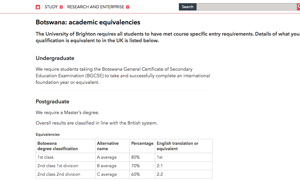
Example: This landing page from the University of Brighton is geared towards international students from Botswana. Students coming from Botswana to study in the UK will be concerned with academic equivalencies – thus the decision of the school to include this key information on the page.
Use Visual Elements to Explain Key Points
Your international student-oriented landing pages can also include graphic elements as a means of helping to combat language obstacles, while at the same time keeping your page less cluttered with text.
Example: Referring to the landing page we saw earlier from the Rotman School of Management, note how they’ve kept wording to a minimum, using graphics to direct prospects to key details. Using easily recognizable symbols like these is especially helpful in considering international students, as these visuals can help them easily spot high priority features, and may help motivate them toward taking the intended action – in this case, downloading the brochure.

Infographics, video, and other visual features can all be helpful for explaining various points you want to get across on the page without words.
Include Testimonials
Studying in a foreign country can be an exciting proposition, but it can also be intimidating to many students and their parents, unsure of how the imagined experience will feel in reality. To that end, having student testimonials (otherwise known as social proof) on your landing pages can go a long way toward encouraging them.
Customize Your Pages to the Region
If you have identified several high-value markets, you may opt to design several independent landing pages under the same campaign, customized to the region. You might also decide to further appeal to your international prospects by translating the page into the language of the region you’re targeting. In these cases, it will be important to hire a proficient translator to be sure your copy is translating well.
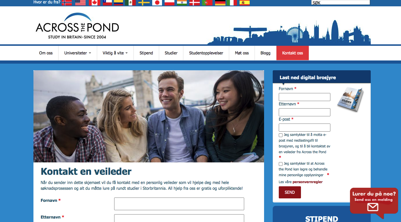
Example: Leeds University has designed several customized landing pages according to the priority of top applicant nations, based on their market research. As students from Norway appear to have been marked as high priority, customized landing pages have been designed with these prospective students in mind, including fully translated pages (as we see for prospects from Norway below):
Test the Results of Your School’s International-Focused Landing Pages
If you put the time and budget into designing landing pages with international prospects in mind (often involving the cost of hiring a third party web design specialist) you’ll be wise to switch up certain elements on the page to see which versions lead to the most forms being filled out.
Google Optimize connects with Google Analytics to allow a company to serve ad visitors different landing pages, tracking the results to show whether the original or new version converts more. Here’s what a comparison of some of those analytics looks like:

Examples of components to compare through A/B testing might include your landing page copy, types of images or video, use of CTAs (e.g. the number of them on the page, positioning, colours of buttons), the addition of testimonials, the addition of customized features for higher-value prospects, your chosen landing page template design, the length and complexity of your lead forms, and more.
Small changes can make a big difference to performance. As a case in point, we can look at UX writing. Also known as microcopy writing, UX writing concerns the small pieces of copy that help users navigate your website, and can include everything from menus to CTAs to prompts in form fields. UX writing has caught the attention of many marketers in recent years, as it’s been discovered that changes to the smallest components of some of your website pages and landing pages can revolutionize performance.
As a stand-out example, data management company Veeam found that changing a CTA from ‘request a quote’ to ‘request pricing’ increased clicks by a whopping 161.66%. Numerous examples like these have led many businesses to hire full-time UX writers purely to focus on ensuring this element of their website and product interface is up to par.
While your school may not go to such lengths, this example does lend some insight into the usefulness of A/B testing for evaluating even slight changes to certain components on your landing pages. You can evaluate which versions of your landing pages are delivering the highest conversions by analyzing the data on your school’s chosen CRM system. If you don’t have a CRM, you can also use more basic methods for gathering data on filled out lead forms, such as Google sheets.
Beyond testing, a heatmap is another tool that can be used to understand how visitors behave on your landing page. A heatmap is a third-party app that shows where the user’s cursor goes on the page, where they click, and how long they spend on the page. Some of these basic stats can also be analyzed through Google analytics, but the heat map goes a little further, showing a CTA that was clicked a lot for example – valuable information for knowing aspects of your landing pages design that are working well.
By taking the time to monitor the performance of your landing pages, you’ll be in a much better position to build the perfect page ingredients for maximizing your ROI.


