
Abandoned shopping carts.
In their analysis of 31 different studies, Baynard Institute determined that on average, 68.53% of online shoppers abandon their shopping carts at the checkout.
Some of the top reason why are:
- Check-out is too lengthy and complicated
- Consumer has questions/doubts that have gone unresolved
One of the biggest challenges e-commerce websites face is providing personalized support within an automated framework – resolving consumer’s doubts and making conversion as easy as possible, 24 hours a day.
Today’s education institutions face a similar challenge.
Prospective students visit your school’s website looking for answers about your school culture, the relevance of your programs, the classroom experience, and their own career paths. They’re looking for easy, personalized ways to get their questions answered without having to wait for your admissions or student services office to open – or for a staff member to answer their email.
Much like the online shopper, students want round-the-clock access to the tools and resources they need to complete their assessment of your school, including academic counselling, campus tours, interacting with your instructors and exploring your teaching methods. Complex tasks for automated tools – but a crucial part of online student recruitment.
But these four examples, which include a university, career college, high school and language program, reveal that it can done – with website features that hold attention, answer questions, and guide visitors toward conversion before they “abandon” their shopping cart and move on to your competitors!
1. 24-hour Admissions Services Keep the Conversation Going
As an increasing number of online vendors embrace the idea of 24/7 live customer service, all of us have come to expect accessible, personalized care outside of conventional working hours.
Some schools are answering the call by moving beyond the customary “after-hours” automated phone attendant (which is more likely to annoy that inspire) or e-mail option – which takes time to process.
Ryerson University keeps the conversation going with prospective students by offering them “Instant Answers” with an automated, interactive tool that does a nice job of answering a wide range of queries:
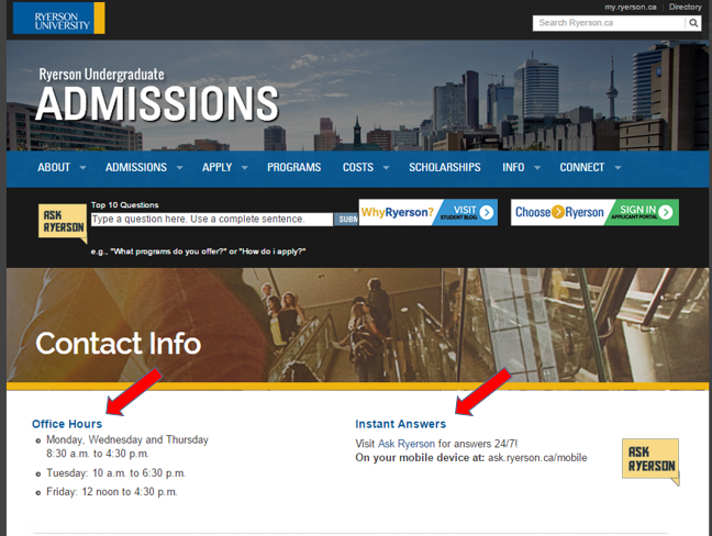
I tested it out by asking for information about residence – a hot topic for many incoming students:

Students get a range of links – a direct route – to the information they need to answer the question. They are guided toward an online registration for a residence tour (so no wait time) and the tool even suggests related questions for further digging. There is also a “rating” feature which Ryerson can use to continually enhance this interactive feature.
This is a simple way to help decrease bounce rates (students abandoning your web page) because they hit an information roadblock and can’t proceed on to the next conversion step (a request for more info, an application, an interview with admissions, etc).
2. Self-Serve Tour Bookings & “See for Yourself” Hyperlapse Videos
Many students and parents will want to visit your campus before committing to enrolment. Your website is a key touchpoint in facilitating this extremely important conversion step.
How easy it is for prospective applicants to book a tour at your school? Do they need to speak with an admissions staff member, submit a long and detailed form, or send in an email to a tour coordinator?
Recognizing how important the campus visit is to encouraging applications, some schools are streamlining the process by setting up a very simple self-serve option on their school website.
The best examples take about a minute to complete, are accessible 24/7, and leave virtually zero gaps through which a new lead may be lost (due to an overlooked voice mail message, email, or otherwise cumbersome sign-up process).
Here’s how the “d.school” does it (Stanford Institute of Design):
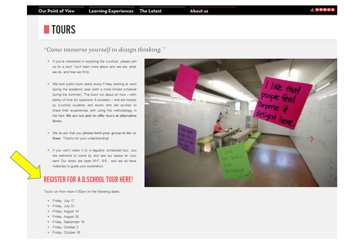
From this link, students are led to a very simple sign-up sheet where they can select their own tour date and specify how many people they’ll be bringing along. It’s interesting to note that Stanford is careful to pre-emptively answer common questions in a short paragraph above the form – so, everything prospective students need to “convert” is right there on the sign-up screen:

And for students who are too far away to attend a tour of your institution? Videos of your campus and classrooms are the next best thing, and should be easily accessible across your website.
Hyperlapse videos are increasingly popular on education websites because of their personalized perspective, time-lapse feature, and “on-the-ground” feel.
Easily filmed by any student or staff member with an iPhone, Hyperlapse can capture your entire campus or facility in a very short amount of time, speeding through the quad or hallways and then slowing down to focus in on specific spaces and people.
Here’s how Roosevelt High School showcases their Hyperlapse tour right on the homepage:
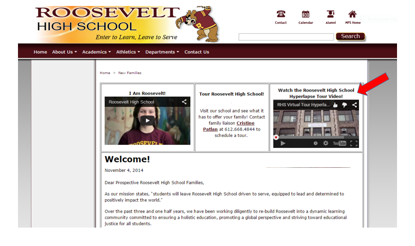
And here’s the video itself – notice how much ground is covered in such a small window of time:

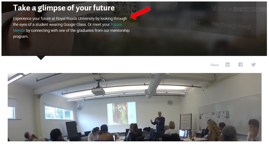
Check out this example from Royal Roads University, who takes insider access a step further by inviting prospective students right into a class-in-progress. They equipped an enrolled student with Google Glass so they could film the lecture and present it to site visitors on their “future view” microsite:
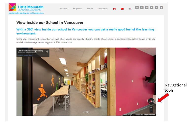
Here’s another take on video campus tours from Little Mountain Learning Academy, an enriched English language learning school in Vancouver, BC. LMLA puts the “camera” in the hands of the site visitor, allowing them to use their mouse to navigate throughout the facility. Parents can stop to look at students’ work displayed in the hallways, “walk around” classrooms, see common spaces and peek into administrative offices.
These self-serve campus video and tour-booking features allow site visitors to access your institution on their own terms, and at their own convenience. They make getting to know your school easy, which is a natural and critical gateway to building trust, establishing a human connection, and encouraging inquiries.
3. Online Trial Classes & Exceptional Content Giveaways
Most education institutions provide a detailed course list and descriptions for their programs. This is an important first step in granting website visitors visibility into what your programs will cover and why.
But as demand for proof and insider access grow ever more insistent, some institutions are giving away free trial courses and premium learning materials to foster confidence in their methods and attract enrollment. And they’re using automated processes on their website to grant round-the-clock access to these services and content!
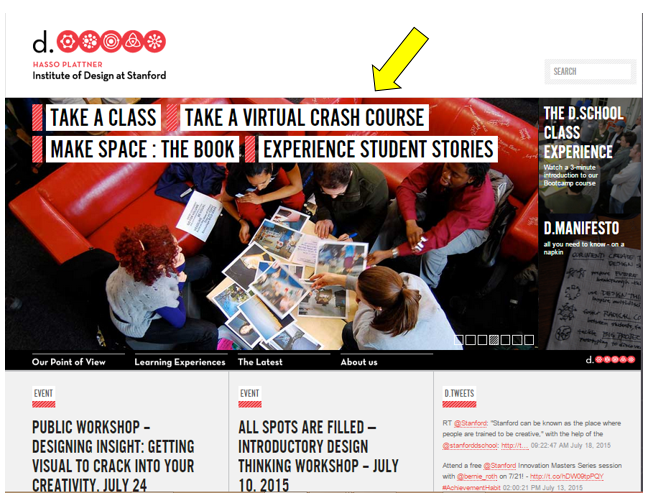
Here is a very sophisticated example, again from the Institute of Design at Stanford. With their free Virtual Crash Course in design methodology, d.school emphasizes its mission and core values, gives away high quality learning tools, and builds their online community, all at the same time – and with 24/7 access to site visitors.
Here is the CTA for the offer, prominently displayed on their homepage:
Deployed entirely off-site, wherever users live or work, the Crash Course walks participants through the entire design cycle, helping them experience what it’s like to conceive of and develop a new product – all using the d.school’s unique methodology.
Here’s what site visitors see when they click on the homepage CTA:
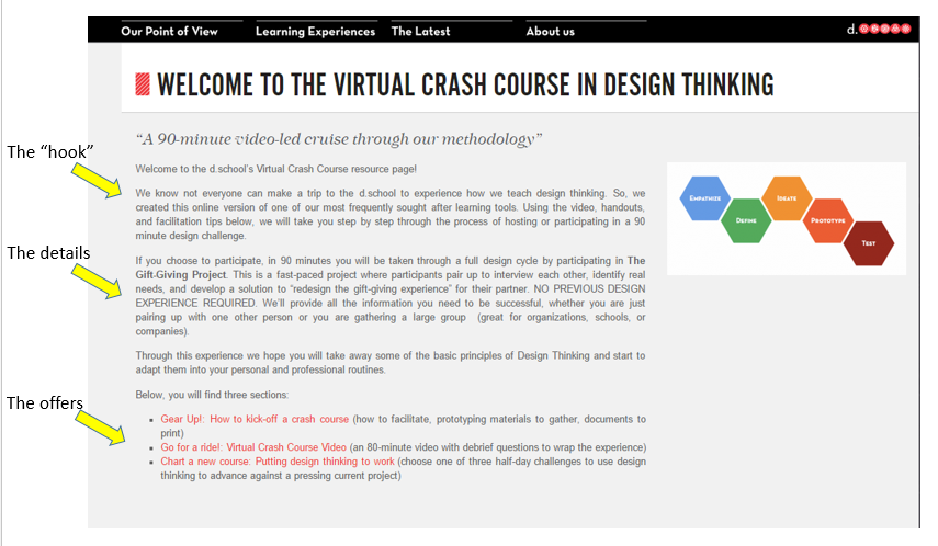
Participants gain access to:
- a Playbook with detailed instructions
- a video with follow-up ideas
- and tools to apply what’s been learned to future challenges
Not only is this content entirely free and genuinely useful (the hallmark of a successful content strategy for schools), it does an excellent job of emphasizing the program’s merits and giving prospective students insight into the school’s teaching style and learning environment (brand-building).
And of course, d.school is leveraging this initiative across social media as well, enhancing their offer’s visibility and potency with a customized hashtag (#dgift). Sharing ideas and outcomes with other people who have taken the Crash Course helps make prospective students feel like they’re already part of the DSchool’s extended community – before they’ve even enrolled!

Considering ways to apply this concept on a somewhat smaller scale, or toward a different target audience?
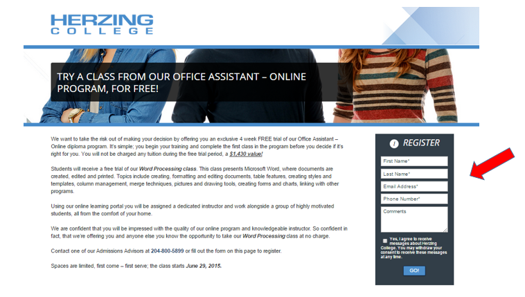
Here’s an excellent example from Herzing College, who offers a free online trial of a popular course. Herzing delivers a full four weeks of content on their Office Assistant program, which includes access to the online learning portal and personalized help from a dedicated instructor.
Herzing pairs the offer with an on-page registration form, which means students can easily sign up 24/7 – convenient for site visitors, and a useful way to generate more student leads:
Simple, seamless, always accessible. These offers work well because site visitors can take advantage of them at any time, with minimal effort and limited assistance from the school. Plus, they go a step beyond your conventional brochure or viewbook. They offer substantial, ongoing value. They get right at the heart of what a prospective student (or parent) really wants to know:
- What and how students learn at your institution
- How qualified and effective your instructors are
- How much support you offer new students
- The quality of the learning materials you provide
- The overall experience of studying at your institution
And if your free trial course is great? Participants won’t need much convincing that full enrollment is their intuitive next step.
4. Custom, Self-Serve Academic Guidance Tools
We recently blogged about the academic decision-making behaviors of Millennial students. Among several key trends that influence their selection process, career-planning and academic guidance services emerged as top priorities.
More than ever, applicants (and their parents) want clear visibility into how your institution’s programs and curriculum will prepare them to meet professional goals. And in addition to career placement statistics and alumni success stories, these prospective students want reassurance that your school provides expert support from A to Z. This includes help choosing a program and selecting courses, career strategy, pathways to post-secondary or graduates programs, etc.
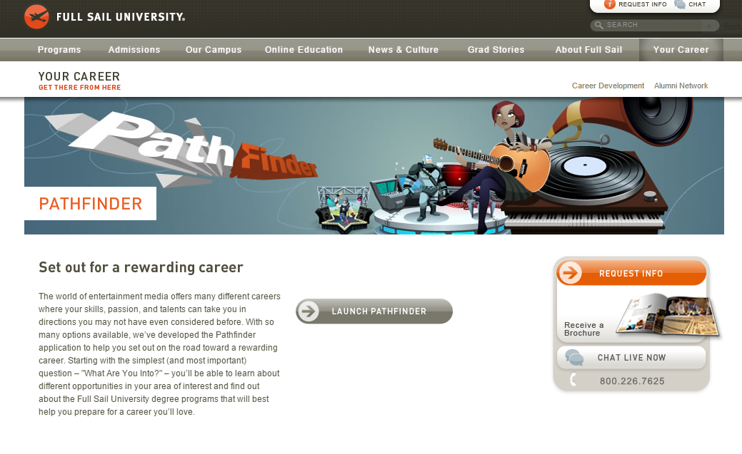
Some progressive schools are showing students they’re on board from the earliest touchpoint – with customizable, 24/7, academic planning tools offered right on their website. Here’s an example from Full Sail University, whose dynamic and fun Pathfinder feature assesses the student’s interests and career goals, and provides links to related programs that highlight key features – and CTAs to prompt next steps.
Here’s how Pathfinder is presented (under the Your Career tab). The description reinforces their capacity and willingness to guide students toward professional success:
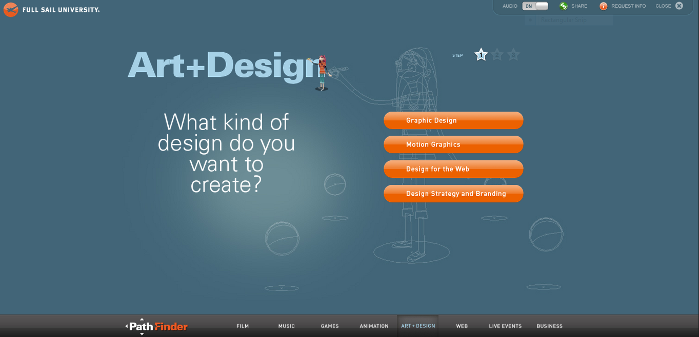
Here’s an example of the tool in action, asking prospective students about their career aspirations in their chosen field of study:
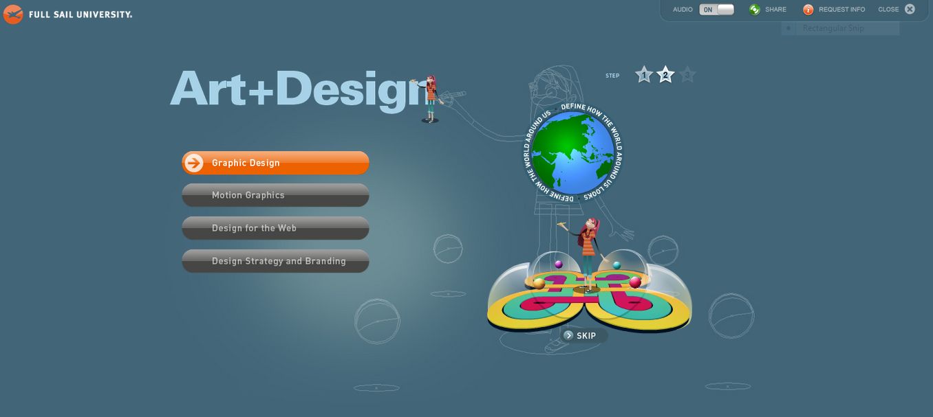
And after the visitor selects which career path they’re interested in, Pathfinder generates an animation that summarizes what professionals in that role do – it’s fun, holds the attention, and prompts next steps to investigate Full Sail’s related training programs:
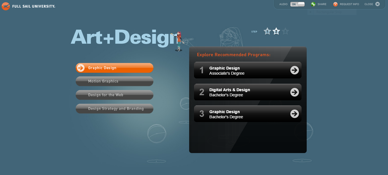
Here are the academic paths Full Sail recommends for achieving those career goals:
It’s a seamless process that guides site visitors toward serious inquiry by providing on-demand answers to some of their most pressing questions.
Here is another example from Herzing College, who also helps potential applicants map out their field of study with an automated tool that provides on-the-spot guidance. Here’s the first step of their “Start Your Career Path” feature:
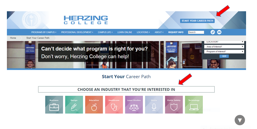
These intuitive mapping tools show site visitors that you understand their needs and are ready to provide relevant advice. Plus, they facilitate a guided tour of your programs and resources that is directly tailored to your audience’s goals – and that’s your quickest route to round-the-clock conversion.
How is your school responding to the demand for 24/7 service? Have you found ways to avoid the “abandoned shopping cart” syndrome by engaging your website visitors with automated (yet personalized) access?


