While there are many excellent design examples out there, the sad truth is that the websites of universities and other educational institutions don’t generally have a great reputation. The combination of having to cater to a number of different audiences as well as the need to include information about a huge amount of programs, faculties, and services makes it difficult to create simple, intuitive sites that will be easy for users to navigate.
The result, all too often, is frustration for everyone from prospective students to alumni, and it’s no surprise that a recent survey by QS Digital Solutions of over 170 education marketing professionals revealed that website design and optimisation was the most frequently cited priority for recruiters, with 32.9% stating that it was the area they would be focusing on most in 2016.
So how can university design teams produce an easy-to-use, aesthetically pleasing, and responsive web design, while still including all the information that their audiences are likely to want? Read on for some useful tips that will help make your website a better place to visit.
1. Conduct a Content Inventory to Build a Logical Structure for Your School’s Website

Does this comic reflect your website? One of the biggest problems users claim to have with university sites is that some of the most useful information is ‘buried.’ This often includes basic things you would expect to find quite easily, such as campus maps, timetables, and information on fees and financing.
Even more worryingly from an online lead generation perspective, details of programs and courses on offer are often organised confusingly. In a survey conducted by Nielsen Norman Group, 48% of prospective students didn’t realise that a specific university offered a particular program, even though it was available. Offering an indexed list of all your programs and courses- and making it easy to find- is a crucial first step to making your website less confusing for prospective students.
Example: Virginia Commonwealth University’s includes fully indexed A-Z lists of both the programs and courses they offer. Crucially, both lists are accessible in just one click from the drop down menu on their homepage.


Other examples of essential information that is not always easy to find on school websites includes contact information for the institution, links to leading faculties and departments, and staff directories. So how can developers refine their designs so that all the most essential information is readily available, while still keeping the site simple and intuitive for users?
The key is good navigation. A site which follows a logical structure and organises its content using a well-defined information hierarchy will be easy for visitors to follow, while eliminating the need for long, cluttered menus and allowing designers to make the layout more aesthetically pleasing for users. Conducting a content inventory of all the information required on your website will help you to organise and categorise your pages more efficiently, identifying the principle areas your target audience need to know about and allowing you to create the simplest navigation bar possible while still covering all the bases.
A content inventory typically involves collecting all the existing webpage URLs, media files and other content on your site and organising it using a spreadsheet. This can be time-consuming, although a number of web crawling tools offered by companies like Screaming Frog can make the process easier. From there, you can summarise each page and its purpose and identify missing information.
Once you’re sure you have everything you need, you can use diagrams to create a natural hierarchical structure for your information, categorising your pages into different sections and prioritising the content that will matter most to visitors to your site.
Example: The University of Chicago’s website has attracted widespread acclaim for its design. It’s simple and clutter-free, yet the logical information hierarchy the drop down menus follow makes it extremely easy to find what you need. As an added bonus, the minimalist structure also gives the site plenty of room to place eye-catching, topical university news at the center of the page using a scrolling slideshow.


One problem you may encounter when trying to create a clear information hierarchy is differing opinions among various stakeholders over what should be prioritised. The ‘design by committee’ approach many schools take is a commonly cited problem in website development, but often necessary given the range of different faculties and departments that need to have input into the process.
Nonetheless, it doesn’t necessarily need to be a hindrance to you achieving your goals, and fostering open communication between your team could help improve the overall site structure. Brainstorming, card sorting and whiteboard sessions are all good options that will get them to work closely together to find solutions that suit all parties and create a better, more intuitive web experience will benefit everyone involved with your school.
2. Apply Proven Design Principles to Your School’s Site
Another way to ensure your website is intuitive for users is to follow tried and tested design rules. It’s well established that the use of contrast, bold type, and a well-balanced colour palette with an even distribution of white space all make web pages easier for users to read. These principles can be particularly important in facilitating the high content density some schools requires on their pages, as a well thought out visual format will make it easier for visitors to take in all the information.
Example: The Cooper Union for the Advancement of Science and Art’s emphasis on architecture, engineering, and fine arts programs necessitates a slightly more content-heavy site than normal, but the design uses contrast and plenty of white space to make it more readable for users.

Studies have also shown that today’s internet users scan pages rather than read them, and that few users scroll down ‘below the fold’ on a page. As a result, arranging your content items in easily scannable snippets at the top of your page will dramatically increase your chances of further engagement.
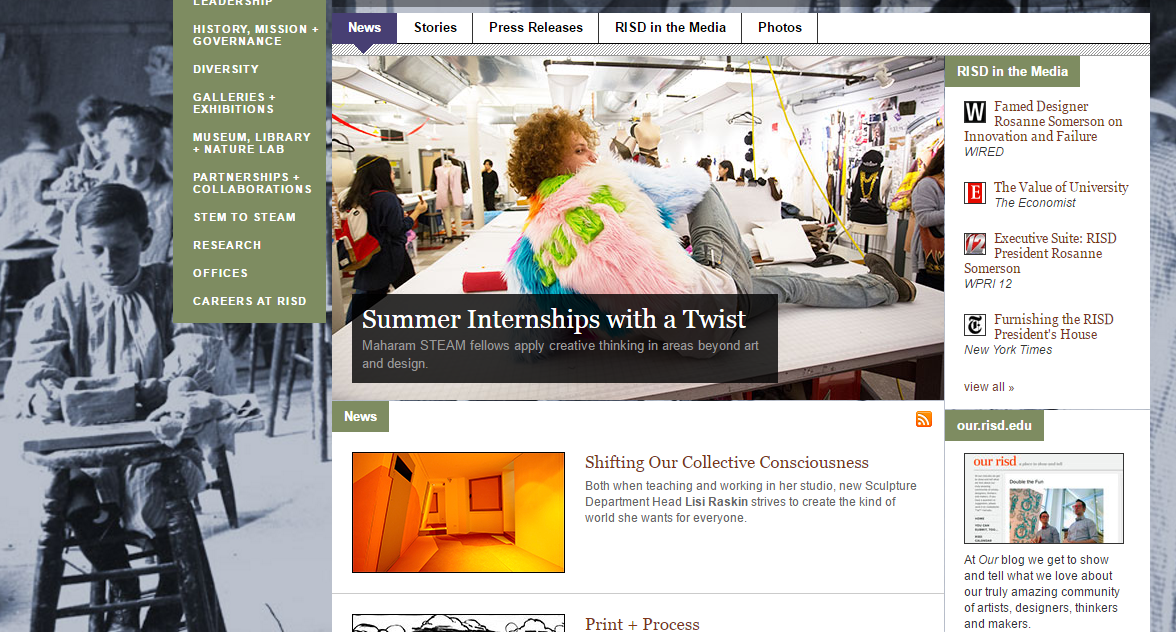
Example: The Rhode Island School of Design’s news page features easily readable snippets, with links to website articles, media stories about the school, and their blog all arranged near the top of the page. You’ll notice that the content follows an ‘f-shaped’ pattern, which is based on the idea that users will naturally scan the page from left to right, and is one of the most commonly used design techniques.

Because many of your prospective students will be scanning your pages, it’s also important to ensure that information that will appeal to them, such as university rankings, graduate career statistics, or any other key selling points of your institution, aren’t buried in the middle of long articles. Many universities incorporate these key messages into their page design as standalone graphics or links, using vibrant colours and large fonts to ensure they stand out, and this can be a useful way to ensure visitors to your site see them.
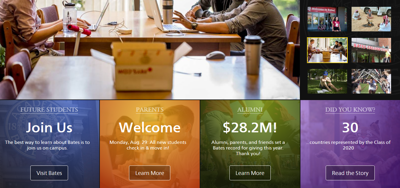
Example: Bates College places short snippets of key information for future students, parents, and alumni prominently on its homepage, with CTAs which link to articles for users to learn more.

Schools wishing to evaluate whether their layout corresponds to design best practices like these might want to consider testing it using heat map analysis. As we wrote in a recent blog, this process can reveal a number of design inconsistencies by mapping the browsing behaviour of users using eyetracking or moustracking software, allowing you to identify any problem areas on your site.
3. Adopt a Consistent Design Language Across All Your School’s Web Pages and Subdomains
Since many larger institutions are divided into different colleges, faculties, and departments, each with an average website’s worth of content to manage by itself, it’s natural that the stylistic elements of certain sections of your website might end up differing. After all, each department has a wildly different audience to consider, and sticking to a totally rigid design structure might lessen the chances of appealing to certain demographics.
Unfortunately, many universities have too much differentiation among their subdomains, with certain faculty sites bearing no resemblance to the main site design, or even failing to make the university they belong to clear and potentially confusing students.
Establishing common design guidelines will help ensure consistency across all your school’s subdomains, different portals, and alternate language sites, making the site more familiar for users and encouraging smoother navigation. A design language should include things like fonts, logos, page templates, and image and writing style guidelines. While there may be some room for customisation among different schools and subdomains, your school should settle on a number of elements to include on every page, such as your logo and a common colour scheme.
Example: The University of Notre Dame has a number of subdomains for each of its colleges and schools, which are often customised to suit their specific audiences. Here, you can see the clear design difference between their business school and their film and television department pages.
However, each subsite maintains some sense of design consistency, using the school colours and featuring the university logo prominently at the top of the page, which also serves as a link to the main homepage, making it easier for students to browse different subject areas.


Your design language should also apply to any microsites or landing pages you develop for short-term campaigns, or external projects such as community outreach programs or research initiatives. Consistency is an important part of branding for schools, helping to give a sense of uniformity and order to all your online content and make it more instantly recognisable among your audience.
4. Don’t Cater to Prospective Recruits at the Expense Of Other Audiences
Even where there have been improvements in web design among many institutions in recent years, it’s worth noting that it has sometimes come at the expense of user experience among certain demographics. School websites have many different potential audiences: prospective students, current undergraduates, postgraduates, alumni, parents, staff, corporate and community partners, and even the press.
Understandably, it’s hard to please everyone, and one complaint cited by many visitors is that the sites don’t seem to be designed to cater for them. Chief among the concerns is that many sites seem set up solely for the purpose of recruitment, with very little information of use for other demographics.

While student recruitment is understandably among the top priorities for schools when it comes to branding and web development, it shouldn’t be the only priority. Not only does focusing too much on prospective students build ill will among other parts of your student community, but it goes against some of the key tenets of inbound marketing best practices. Today’s intelligent, media literate audience tend to respond negatively to direct selling, and a website which is pitched solely towards driving them to make an application will not resonate well.
In addition, prospective students visiting your website are looking to get a feel for what life as a student at your school will be like, and seeing content designed with current students in mind will be seen as an encouraging sign that the university cares about its current student body as well as new recruits. With that in mind, finding some balance in your information hierarchy and ensuring your site has a more broad appeal could actually be helpful to your recruitment efforts.
But how can you do this while still maintaining a simple design? Many college websites include navigation bars that categorise information into different audiences such as current students, prospective students, postgraduates etc., and this can be a useful way of helping visitors find the information they need.
To ensure you cover all of your bases, it might be worth creating and defining personas for your current students, faculties, and other groups, just as you would with potential students. This will allow you to define their motivations more clearly and ensure your site works to engage as many people as possible.
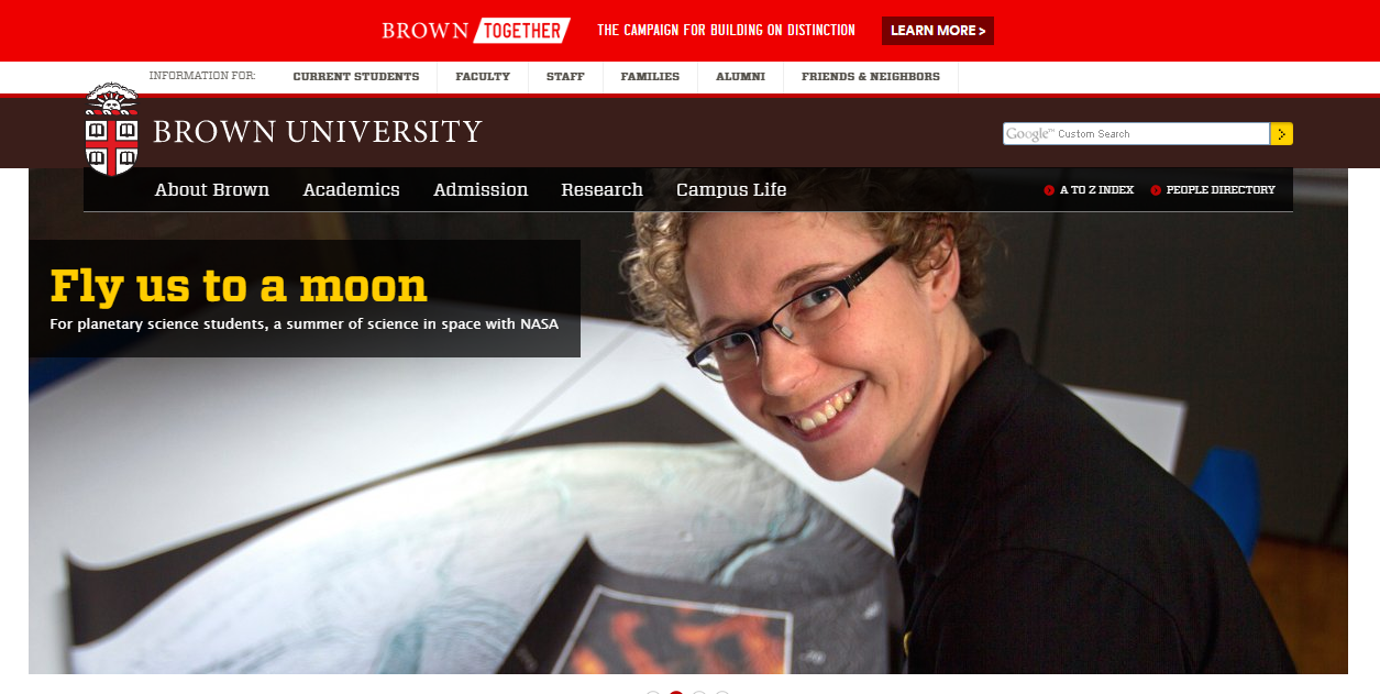
Example: Brown University’s website is a good example of a design which clearly offers information for a number of different audiences while remaining clutter-free and easy to navigate. You can see a secondary navigation bar for each of their different personas, including everyone from ‘current students’ to ‘friends and neighbors.’ You might also notice that the content highlighted on its home page, which relates to interesting research projects, has potentially broad appeal among a range of different audiences.

Creating the best possible website for your school takes time, and can involve a lot of trial and error. Conducting usability tests with sample members of your target audiences when you make changes can be worthwhile, and help you evaluate whether any new elements you have implemented have had the desired effect. Monitoring the browsing habits of visitors through cookies and setting clear goals through Google Analytics are also useful ways to measure the success of your development initiatives, allowing you to refine and customise your site over time to better reflect the needs of your audience.
What do you feel could be improved about your school’s website? What changes have you made in the past that have improved your site’s usability? Join the conversation in the comments section below, and tell us about your experiences!


