There has been a recent buzz about why academic program pages should are the most important pages on college and university websites. Industry experts are discussing program pages in the context of several factors, including simmering enrollment rates, the increasingly popularity of online education, and career-focused students. The driving point that is being made is that the higher ed market is shifting, and well-developed program pages will play a huge role in helping your college or university garner active recruitment while on the cusp of change.
While the recent discussions have been focused on WHY program pages are important, we wanted to focus on HOW you can develop your program pages so they become effective student recruitment tools.
1. Intuitive navigation
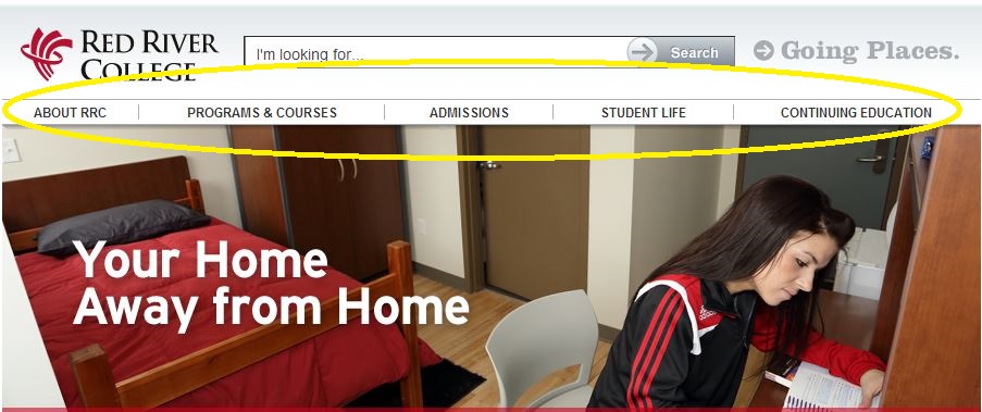
Your users will notice what is showcased on your homepage, so it makes sense to gear their eyes and the click of their mouse towards your main program page. But the homepage is only part of the navigation equation. Ultimately, you want to make sure your visitors find the program page regardless of where they land on your website. For example, if a user visits your site for the first time through a link to your blog, will they be able to find the program page as easy as they would from your homepage? The answer to that question needs to be “YES!” Set up your navigation menu so your main pages (Programs, Cont. Ed, Student Services, Research, Community, Financial Aid, etc.) are always visible.
Example: Red River College designed a very clear and intuitive web navigation, allowing users to zoom in on what they’re looking for, as well as discover other services and initiatives happening at the college.

2. Clear layout
Once a prospective student lands on a particular program page, you don’t only want to be sure that they find out all of the information they are looking for, but you also want to be sure they find the information easily. A clean and simple page layout will insure that all of the required information is directly on the program page, which will in turn avoid having users feel unclear about any of the program details or admissions processes.
Some vital pages to include on each and every program page are:
- Admission Requirements
- Program Outline
- Career Options
- Financial Aid
Example: Centennial College lays out their program page through five different information tabs, each one leading the user into section of important and relevant information that will help them understand the advantages of applying and studying at Centennial.

3. Call to Action = Student Reaction
A while back, Scott spoke about the role Calls to Action (CTAs) play in the conversion process. Ultimately, CTAs guide users on what their next step should be. To figure what your CTAs should be, try to adopt the perspective of a prospective student. Think of the possible questions they would ask themselves after reading all of the available information, and design the calls to action based on those questions. For example:

Example: Drew University’s program section has been gaining a lot of attention lately, and rightly so. The design is fantastic through and through, but one detail that really caught our eye was Drew’s use of CTAs. The CTAs are simple, concise, and placed on top and on bottom of each program page. In this snap shot, we see four distinct CTAs below a student testimonial. This shows that CTAs are not complicated items to integrate onto a page, and the simpler they are, the better.

4. The right kind of SEO
The ultimate aim of your program page is to engage a prospective student, but before that can happen you need to get them to visit the page. We understand when clients express the idea that search engine optimization strategies may undercut the value of content. But this isn’t true. SEO is a tricky tactic, but when executed properly it can become an extremely valuable asset to online visibility.
Part of SEO best practices is choosing the right target keywords and properly integrating them in your content. Without overloading your page with keywords (which can actually reverse the desired SEO effect), you should zone in on a few target keywords that you want the page to be visible for, and integrate them into the content naturally and coherently. By doing so, you increase your overall visibility on search engines, which will help students find you while they are scoping out which schools to apply to.
5. Various types of content
I will always be the first one to defend the written word, but when it comes to web sites, sometimes words just aren’t enough. Informative content will be the foundation of your college or university website, but it’s the images and videos that will make it thrive. In regards to program pages, try to integrate various types of content so students can learn about your program offerings through different mediums. For example, integrate photos of students on campus or in residence, or videos of students interacting with their classmates and professors in class. The benefits of diverse types of content can be measured both in user engagement and online visibility.
Example: Carleton College’s main program page features three distinct types of content on the page: text, photos, and a reel of videos that feature students from all different disciplines discussing their overall academic and campus experience.

Your website is a major starting point for many prospective students, so you need to insure that it gives what they are looking for. Implementing these elements will bring a heightened level of overall functionality to your program pages. The goal is answer any questions students may have, and show them the benefits of enrolling at your college or university. If students land on your site and are able to swim through all the pages fluidly, and can grasp the potential academic experience they will have at your school, then they will likely feel fully informed and ready to apply.
What have the most effective tweaks your college or university made to your program pages?


