
There’s little doubt that prospective students both near and far are using their smartphones to learn about your school.
A 2015 Pew survey revealed that a whopping 86% of 18-29 year olds in the United States own a smartphone.
IDC reported that smartphone sales in Africa and the Middle East soared by 66% in 2015, reaching 155 million units (Nigeria, South Africa, Saudi Arabia, and Turkey topped the highest sales list).
Some experts are predicting that global smartphone users will climb to well over two billion by 2019.
Global Smartphone Users from 2014 – 2019

Interestingly, a recent Neilson report found that smartphone users are increasingly reliant on their devices when researching, comparing, and purchasing goods/services online. The freedom to complete tasks anywhere, anytime (including of course, school selection) is cited as particularly empowering, and this is what’s driving the trend forward.
Add this data to another section of the report, which found that 86% of users prefer apps over mobile web, and you’ve got a compelling case for getting your school onboard with apps.
Prospective and current students are hungry for sophisticated, content-rich apps that can streamline their school “shopping” process, and continue to serve them throughout their degree.
College and university apps have gained traction over the last few years, and are continuing to evolve to meet students’ growing expectations.
There’s a movement away from a one-size-fits-all approach, toward unique, engaging, finely targeted features and content that will aid in the recruitment phase – and keep enrolled students coming back for more.
What characteristics do these next-gen apps possess?
Here’s a look at 7 ways schools are upgrading their apps to attract and retain more students.
1. Self-Guided Campus Tours Led by Student Ambassadors
Looking to engage students who can’t make it to your open day? College apps that include a virtual or self-guided tour are ideal for recruiting international students, or locals who prefer solo visits to large group tours.
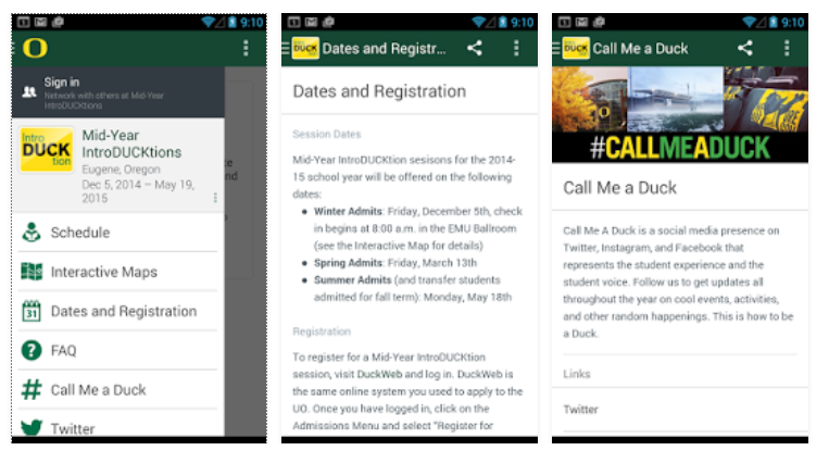
The University of Oregon recently announced their own new self-guided tour, which is included when students download their comprehensive “Be an Oregon Duck” app. Any student with a smartphone and a pair of earbuds can explore the UO campus at their own convenience, and with the benefit of the following app features:
- A built-in GPS system that tracks where the visitor is on campus, and displays corresponding information and images (the app “moves” with students, just like a traditional tour)
- Robust content, such as student profiles, admissions and housing FAQs, and details about important landmarks
- Regularly updated photos and information
- Option to easily submit contact information and request additional application materials from the university
But what I like most about this self-guided tour, is that it’s narrated by student ambassador, Frank Laro – an undergraduate at the University of Oregon. Student ambassadors have become increasingly important in recruitment content marketing, lending in invaluable layer of authenticity and “social proof” to institutional messaging. A student-led tour adds a personal touch, while helping schools steer clear of a salesy or self-promotional tone.
Here’s a look at the branded UO app:
2. Compelling Storytelling & Creative Content
Up until now, most college and university apps have focused on giving students practical information like campus maps, a calendar of important dates, and access to their class schedule. And while these resources are indeed important, they don’t offer much insight into what life is truly like at your school.
And that’s exactly what the University of South Wales has set out to accomplish with its UniBox Uni of South Wales app.
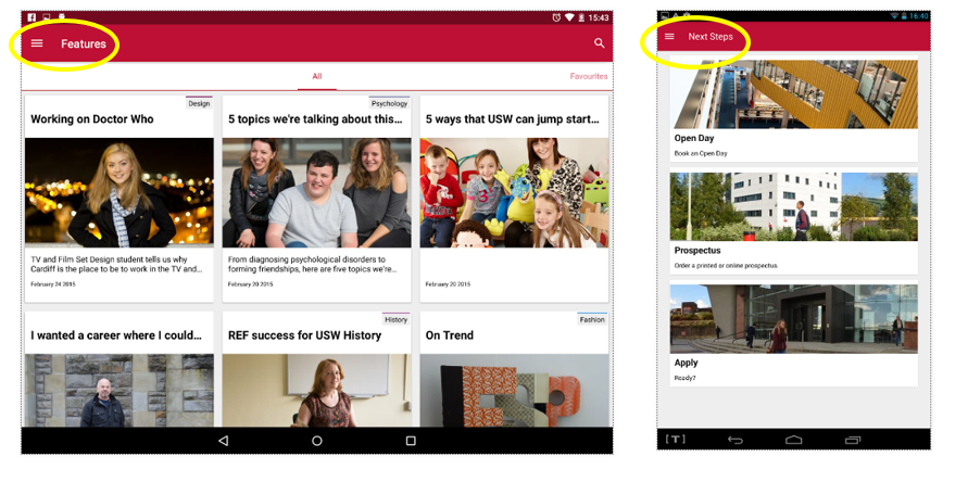
USW uses multimedia storytelling to showcase its campus and individual programs, pushing out over 270 pieces of content through the app, including:
- Images and information on campus facilities, residences, and grounds
- videos of lectures
- a news feed students can customize by favourite subject area (drama, film, business and management, accounting and finance, nursing, biology, forensic science, history and English)
- films and photographs of student life
- playlists and fun quizzes
- interviews with clubs and societies
- interviews with lecturers
- application and program-selection tips, plus other resources for both prospective and current students
This app is all about content marketing, drawing students in with compelling storytelling combined with genuinely helpful tools and resources.
And that’s not all! Prospective students can also book a tour through the app, order a prospectus, access an open day timetable, and view a campus map.
One of the strongest features of the UniBox Uni of South Wales app is its enduring value. The content is updated regularly to keep students coming back for more, and engaging with new narratives, throughout their entire length of their degree. This is a great example of inbound marketing for schools, which focuses on organically attracting, engaging, and converting students with customized content.
Here’s a look at the “Features” section of the app, where we hear from professors and students, along with practical “Next Steps” toward application:
3. An Impressive Range of Practical Tools
Universities and colleges are looking to pack as much into their mobile apps as possible, moving beyond expected content like campus maps, orientation guides, and course timetables.
Next generation apps are now integrating modules that track everything from bus times and meal plan balances, to when the nearest campus laundry machines are free for use.
California State University Northridge (CSUN) takes practical task-completion to the next level by offering students the option to pay tuition and enroll in classes via their app (borrowing the familiar “shopping cart” motif from the world of e-commerce):
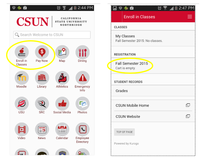
The goal is to provide a one-stop shop for students, taking them all the way from initial inquiries and a campus tour, to enrollment, course selection, and payment – all from the app. Users move seamlessly from one touchpoint and task to the next, making it easier than ever to generate new student leads and nurture them toward conversion.
4. Segmentation by Personas & Life-Cycle Stage
One might assume that as college apps continue to pack in more modules and features, they’ll become confusing to navigate and overwhelm the user.
The strongest innovators avoid this problem by segmenting their applications by several key audiences. Schools are now creating persona-specific versions of their apps, with tools and content that correspond to the user’s wants, needs, and life-cycle stage.
In fact, the user is funneled into their designated “segment” at the point of download – avoiding bombardment with the app’s full complement of options and resources.
Here’s a great example from the University of Arizona, which offers several “editions” of its app, segmented by persona:
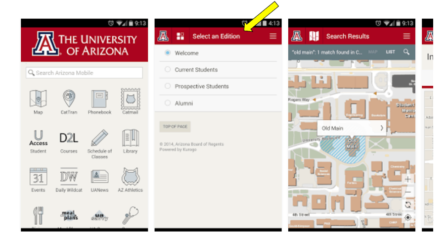
After selecting their “group” users see content and tools that are most relevant to them. Alumni can bypass information about orientation or campus tours, and go straight to updates on reunions, networking events, and fundraisers. Meanwhile, prospective students can hone in on application procedures, open days, and engaging with stories about life on campus.
Colleges and universities might also consider creating app editions for international students, online students, or parents, depending on their recruitment goals and target audiences. Segmentation is another great way to ensure your school app stays relevant to students throughout their degree, and beyond – serving up easily accessible, customized content at every life-cycle stage.
5. Event Modules & Real-Time Communication
Event modules represent another important app upgrade for colleges and universities this year. An events section helps invite prospective and current students into your school community, while offering a platform from which to promote important happenings on campus (open days, career fairs, orientation events, commencement, student-led initiatives, athletic matches, etc.).
Here’s a simple example from Georgetown University, whose app includes a “This Week in Georgetown” module. Students get regular updates about campus events, including fun and entertaining stories, and are invited to contribute their own ideas for future posts:

In addition to events modules, progressive school apps are starting to include advanced communication features that allow for real-time updates and announcements. Want to send out a reminder about an upcoming open day, let students know bus service is delayed, or that classes have been canceled? Your school app can do that using:
- push notifications (works even when students are not engaged with the app)
- iBeacons (messaging tailored to students’ location on campus)
- in-app messaging (banner messages on your app home screen, on specific pages, or across the whole app)
6. In-class Instructor Evaluation
In order to increase participation rates, Ohio State University (OSU) is planning to integrate an instructor evaluation feature into their mobile app. OSU saw participation plummet when it replaced in-class Scantron evals with web-based options designed to be completed outside of class. Students simply didn’t bother filling out the form.
Since this data is an important part of measuring student satisfaction (and supporting retention), OSU has considered adding an in-class instructor eval feature to their mobile app. Students can complete their evaluations during class time, using their smartphone.
Web and Mobile Apps Director Stephen Fischer believes this approach could help response rates reach close to 100% again. He says, “We’ll add push notifications, so potentially a good percentage of students before the last class will have already filled them out.”
That would certainly be an intriguing use of those real-time communication features we mentioned earlier.
7. Involving Students in Mobile App Development
Some of the best higher ed apps let students lead the way during design and development. After all, who better to decide what your school app should offer than the people who will actually use it!
Including students in the development process offers several benefits, including lower costs, real-world experience for your budding developers, and a valuable opportunity for meaningful collaboration.
The University at Albany and Ohio State are just two of many schools who leveraged students’ unique insights when deciding what should, and should not, make it into their mobile app.
For example, when Shivam Parikh (a computer science student at University of Albany) was developing his school’s app, he came up with the idea of an automated message students would receive when their laundry was done. This is likely not something administrators would have considered incorporating into the app, but is a prime example of the kind of targeted, practical tools we’re seeing more of now.

This is yet another great example of the key role current students should play when schools develop resources for recruitment, engagement, and retention.
What’s in your school’s mobile app? Are you integrating any new modules or features this year? We’d love to hear your comments or questions in the section below.
Additional Resources
This webinar/slideshare from Modo Labs offered very helpful insights for this post, and is worth a watch if you’d like more examples of leading college and university apps.


