Picture a prospective student browsing through your school’s website.
Can they find the information they need? Is your site guiding them to the next step in the admissions process? And how many clicks does it take them to get there?
On the other hand, let’s say someone visits your site without knowing much about your school: how long will it take them to learn about the different programs you offer?
Your answers to these questions will reveal the general health of your website’s information architecture (IA) – or, in other words, how your site is structured and organized. The better your website’s IA, the easier it is for prospects to get from point A to point B on your site, and the less friction involved in funneling leads towards enrollment.
Could your school’s site use some restructuring? Read on to learn how an information architecture update can help prospects seamlessly navigate your site.

Information Architecture: A Primer for Schools
Although “information architecture” sounds complex, it’s actually a rather simple concept. IA describes how your web content is grouped and presented.
IA involves both big picture elements – like your site’s content hierarchy – as well as smaller details such as how search results are organized on a page. Essentially, anything to do with website navigation – from menus, to search capabilities, to on-page links – falls into the realm of information architecture, because how you choose to organize your content directly impacts how users access it.
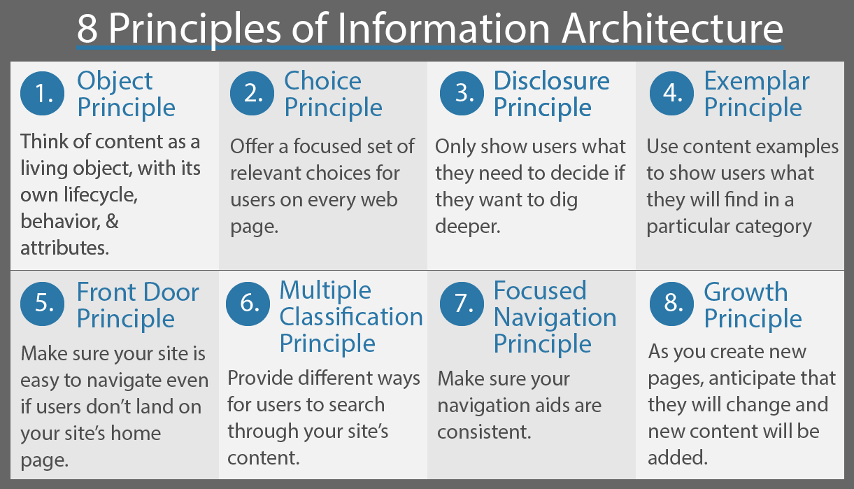
To understand IA on a practical level, these eight principles, developed by UX designer Dan Brown,offer guidance for building a bulletproof information architecture for any website.

Source: The American Society for Information Science and Technology
If your school is looking to improve its information architecture, these principles provide a great starting point.
Analyze the IA of Your Higher Education Website Design
Before you go about restructuring your entire website, first take a look at your current information architecture to find out what is well organized and what needs improving.
Since IA is all about navigation, you can assess your site’s information architecture by examining the various paths your prospective students take in order to find the information they need on your school’s site. This means adopting the mindset of your personas and analyzing your website structure from their perspective.
Consider Your Ideal Website Visitors
There’s no one way to improve a website’s information architecture.Because the most effective IA will be one that offers optimum navigation for your target audience, the steps you need to take will depend on the needs of your prospects.
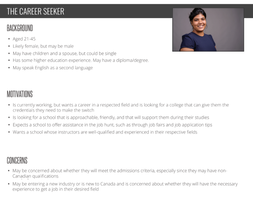
To find out what sort of IA is best for your school, you first need to think about your prospects and how they use your school’s website.What kinds of things are they searching for? What content do they expect to find? And how do they expect to find it? Thinking about your personas can help you better understand their website behavior.
Example: This persona expects their school to offer job assistance, so make sure your career resources are readily available on your site. That way, prospects will know that your school offers ample help in this area. In your admissions section, it may also be beneficial to include pages offering information for international applicants since many are concerned about whether they will meet the admissions criteria. Knowing the key information prospects are looking for before enrolling will help shape your education website design.

To supplement your persona considerations, you can also use your website data to better understand how prospects use your site.
Your website insights will show you what your most visited pages are, which have the lowest bounce rate, and more. These stats can help you determine the kinds of content you should be prioritizing on your site.
Create Scenarios to Track User Flow
Once you’ve adopted the mindset of your prospective students, now’s the time to step into their shoes and imagine how they navigate your site and find content.
Come up with a few different scenarios your prospects are likely to experience when first visiting your site, and determine how many clicks it takes for a prospect to get from your homepage to a particular page on your website.
Crafting scenarios and recording user paths is one of the most important higher education website best practices when it comes to IA. Through this process, you can assess a prospect’s journey when they search for key content on your site.
Example: Let’s say you come up with the following scenario, which you give to a volunteer or another member of your team to complete: “You area driven university student looking to get your graduate diploma in accounting at Queen’s University. Since the biggest decision-making factor for you is academics, you visit the university’s website to learn more about the curriculum. Where do you find what you’re looking for?”
Looking at the website, the first logical step would be to click Academics from the main menu. There, you can narrow your search by clicking Faculties, Programs & Departments.

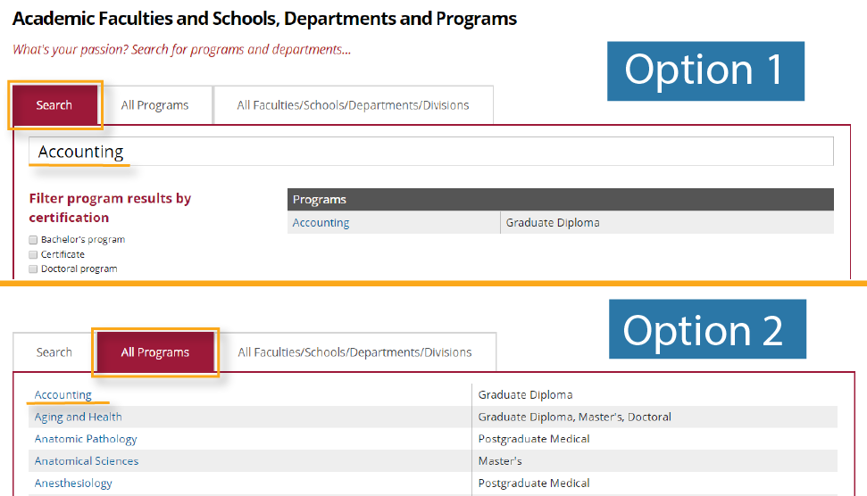
From there, you are given two different ways of finding the accounting diploma page among the other programs. You could search for it directly or browse a list of programs. While it may be tempting to click the All Faculties/Schools/Departments/Divisions button, you’ll only be able to find the general Smith School of Business website there.

Regardless of which option you choose, you’ll be brought to the accounting page of the Smith School of Business website. To learn more about the courses the program offers, click Curriculum from the left-hand menu.

After you’ve looked through the different courses and are satisfied with what the program offers, you are invited to click Apply Online in the top right-hand corner which brings you to Queens’ online application.

After completing the scenario, you can map out the path you took in a user flow chart.

User flow charts show how many menus or pages your prospects need to navigate in order to land on the page they’re looking for.
By visualizing these pathways, you can identify any snags or shortcomings in your website’s navigation – which will be addressed in the next stage of the IA optimization process.
Restructuring Your Education Website Design
Now that you have a better understanding of how your prospects experience your website, you can reevaluate your current content groupings to make navigation easier and the user journey shorter.
Many IA experts consider card sorting to be the most effective way of surveying your content inventory and figuring out how to best group it. Then you can use wireframing, another popular IA exercise, to identify where each content group best fits on your website.
Map Out Your Content with Card Sorting
Card sorting involves writing out all your web content on index cards – each page has its own card – and organizing them into categories.
This activity generates the best results when you have outsiders sort the cards, as they can analyze your content with fresh eyes – but you could still successfully conduct the exercise with your coworkers.
After each person creates their ideal card structure, record the results. The more you understand how people approach your content, the more intuitive your website’s IA will be.
Although card sorting is labour-intensive, it’s also essential. Mapping out your web pages allows you to find the best content groupings to form the foundation of your site’s information architecture.
Example: Just as user flow charts help you visualize your website navigation, card sorting helps you see all the content that is part of your school’s IA. In this card sorting case, the web design team colour-coded their cards by content type to create a more descriptive representation.

If the thought of ordering cue cards or post-it notes is too tedious for your liking, there are also online card sorting programs you can use such as OptimalSort and usabilitiTEST.
For schools that tend to have fewer pages, like language schools and K-12s, the manual card sorting method tends to be quite manageable – but for universities, or schools with plenty of web content, online card sorting makes it easier to involve more participants.
Structure Your Content with Wireframing
Now you’ve got a whole lot of content groups – great. But how do you transform your cue cards into information architecture?
To answer that question, first look at your school’s current site and draw a wireframe diagram. It can be as simple as the one below, which HEM created for a client.

Then ask yourself the following questions: do my new content categories fit properly into this structure? Do my menus prioritize the most important information? Is my website navigation as intuitive as it could possibly be?
If your answer to any of those questions is not an affirmative ‘yes’, you may have to rethink your design to better organize your content. But don’t be alarmed: sometimes the trick to user-friendly navigation is as simple as editing your menu structure.
Example: Depending on how many pages your website has, a single menu bar may suffice, as it does for British International School of Boston. When you scroll over each menu item, a sub menu opens up.

Or, you may need to create a double hierarchy with one menu for global navigation and one menu for local navigation.
Example: Since university websites contain a great deal of content, more than one menu is often needed. The top menu of the University of British Columbia’s site is organized by topic (such as admissions and research) while the secondary menu is tailored to the different kinds of people that visit the university’s site. Each menu item brings a user to a core page full of links, sub-menus, and resources.

You may have noticed that in all the examples above, the menus are located at the top of the homepage. Generally speaking, this is the most intuitive way to format your menus, but depending on your web content, a sidebar menu may be more effective.
Example: LSI Vancouver’s central navigation is located in a hamburger menu which users can open by clicking ‘Menu.’ This layout offers more space for images, which can be helpful if your school wants to showcase itself as a travel destination.

Once you’ve determined what sort of menus best fit your school’s website, now’s the time to go back to the drawing board (literally) and create new wireframe diagrams based on your optimum website layout.
Optimize Your Information Architecture for Search
Improving your information architecture is all about enhancing website navigation – and making your site’s search capacity as accurate as possible is a big part of the process.
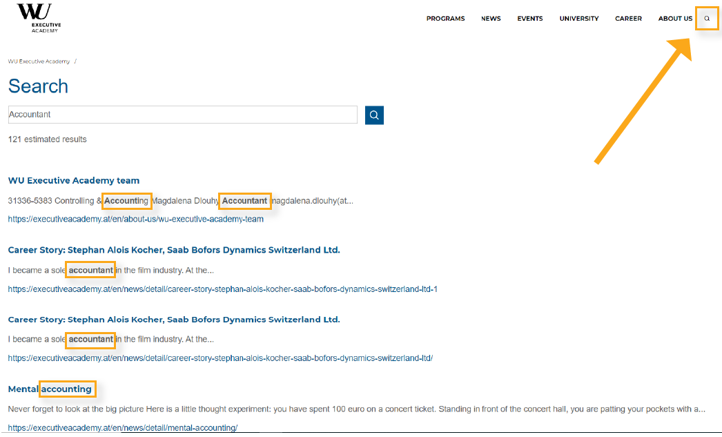
For starters, make sure your search bar is always visible. Most websites have it in the top right-hand corner, so that’s where yours should be too, unless that placement doesn’t work with your design.
There are also different ways you can improve your results page in order to make it as easy as possible for prospects to find what they need.
In addition to the page title and description, consider including the date the particular web page was created – especially in the case of blogs – on your results page. You may also want to show how many results a particular search generated so prospects know whether they should specify their keywords.
Example: No matter what page you visit on WU Executive Academy’s site, you can always click the search button to find what you need. Notice how the description of each result is directly related to the search inquiry, and the keyword is indicated in bold.

In addition to formatting your search results page, you also want to make sure that the results, themselves, are as accurate as possible. To do so, you’ll need to evaluate how you classify content on your website by looking at your taxonomy and metadata.
In simple terms, taxonomy is a way of grouping things together, and metadata is a way of tagging your web pages so that users can search for content based on your taxonomies.
A language school, for example, may consider sorting its program pages into the following taxonomies: language, program length, program type, and program location. The school could then tag each page with the respective parameters, such as ‘English’, ‘6 week’, ‘evening class’, and ‘London’.
This way, a prospect could search ‘intensive English evening class’ and easily see which locations that offer that type of course, as well as the different program lengths available.
By improving your website’s information architecture, not only do you make it as easy as possible for prospects to gather the information they need to move through the enrollment journey – you are also improving your school’s brand reputation in the process.
Having a website that is easy to navigate demonstrates to prospects that your school understands the concerns of its students, and has the content readily available to solve them. In contrast, if prospects can’t find the information they need on your website, your school will look less helpful and resourceful in the eyes of a prospective student.
The goal of your higher education website design IA should be to make your navigation so smooth that people aren’t even thinking about how to find what they are looking for – instead, they are only thinking about your school and what it offers.


