Schools today are facing a rising challenge to engage potential students with the information and data that they put out. The diminishing attention span of audiences and the growing expanse of digital content have forced institutions to rethink how they approach prospects.
When it comes to wowing potential students with statistics and facts, many schools hit a wall on how to communicate that data in an appealing way. An infographic (information graphic) is a smart solution to inform and entertain readers for more effective engagement. It’s no surprise that infographics were the fourth most used type of content marketing in 2021.
Combining images, data visualizations and text, infographics tell a story – one that can highlight the values and experiences of your school. By marrying data with visuals, infographics offer an accessible form that meets the needs of digital audiences today. Find out how your school can use infographics to deliver key messages to prospects.

The Value of Data in Attracting Students
There’s nothing more reliable than facts and figures. In a competitive education market, prospective students want to know that they are choosing a reputable school for their learning. With access to the right data, applicants can rest assured that their choice can deliver the outcomes they expect.
Educational institutions lend themselves well to facts and statistics. In turn, data lends credibility and repute to your school’s brand. Information on a school’s ranking, rates of graduate employment or university acceptance rates are all things that weigh heavily on the minds of students.
A career college might opt for stats on job placements for graduates, while a prep school might highlight stats on university acceptances. In each case, creating effective infographics is a way to use data to convey compelling facts to prospects. More than anything, they translate complex data into digestible content.
Example: Harvard Law created this infographic to highlight some of its most attractive figures to applicants. It includes key data on graduate employment rates, the student to faculty ratio and participation in student activities. Presenting these facts in one place helps to build a clear and detailed picture of life in its Law program.

Source: Harvard University
In addition, some institutions may use infographics to present a narrative of the education market and how their school fits into that space. This is an opportunity to use national or global statistics to support your school’s offerings.
Example: This infographic from Orinda Academy includes a comparison of test scores from private schools and public schools across the US, along with comparative university acceptance rates, to support its reputation as a private high school.

Source: Orinda Academy
Showcase Your School Through Visual Storytelling
While statistics are impressive to applicants, it takes more to build an authentic image of your school. Part of capturing prospective students involves helping them to envision their life at your school. You should aim to build a sense of excitement by making potential students a part of the shared experience.
Infographics are a way to bring your school to life beyond the facts and figures. Research has shown that 32% of marketers believe that visuals are the most important type of content that their business creates. As a means of visual storytelling, infographics break down the narrative of your school into select and precise points. In their form, they engage prospective students with accessible, readable content.
Determine Your School’s Narrative
With the volume of digital content available today, effective content marketing for higher education is about simplifying what your school is about. Visual storytelling is a way to channel your school’s main messages – its values and direction – to create a more personalized and emotive digital marketing strategy.
Example: An infographic from North American Trade Schools (NATS) positions the school’s programs in the context of the demand for skilled tradespeople across Canada. It sets the scene of the job market and explores how the learning experience at NATS prepares students for that reality.

Source: North American Trade Schools
Similarly, Medix College designed an infographic that entices prospects with a vision of their future career. Using simple lists and supporting graphics, this infographic describes what students can expect from an education in their massage therapy school.

Source: Medix College
Communicate Program Information That’s Important to Prospects
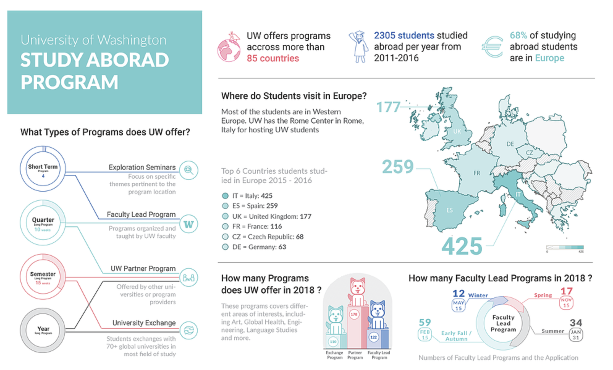
Infographics are also useful for introducing specific programs or activities at your institution. First and foremost, infographics should be informative, and the information that is most valuable to prospective students is about the learning experience on offer at your school. Not to mention, highlighting key aspects of programs that are unique to your school is a great way to build an authentic brand image and stand out from the competition.
Example: This infographic from the University of Washington lists key information about its Study Abroad Program, including the types of programs on offer at UW and statistics on the number of students that participate in the program. Applicants interested in studying abroad for part of the university program can learn about the unique experience that they can get out of studying at UW.

Infographics Merge Data With Design
In a recent survey of content marketers, the majority of respondents said that 91-100% of their content includes visuals. At the same time, 32.5% of respondents said they used infographics more than any other type of visual. This is because infographics lend themselves well to data visualization. When designing infographics, facts and statistics are formatted on the page in a way that draws the reader’s attention. Visual aids and other elements of design are also a chance for your school to bring a personalized brand image to the objectivity of the data.
When creating education marketing content, the trick is to find the right balance between information and graphics. You want there to be enough information to satisfy the inquiries of potential students and enough data to support your school’s claims. At the same time, you need sufficient stylistic elements to make the content easy on the eye.
Attract Prospective Students With Colour Schemes and Typography
Once you have the data down, it’s about choosing the best way to present that information. Consider the font, size and placement of the text on your infographic, as this will determine which facts your readers are drawn to.
Colour is another way to highlight critical information. You want your infographic to have an identifiable colour scheme – one that resembles your school’s brand. At the same time, keep in mind colour palettes that attract the eye and look out for those that distract from the information.
The design of an infographic should be tailored to attract your school’s target audience. You may opt for triadic colour schemes to add playful contrast to your infographic, or a monochromatic style for a subtle and sophisticated backdrop. Generally, you should use brighter colours for graphics and muted colours for information and data.
An infographic created by Hult International Business School uses a simple design that includes key data to highlight their international learning experience along with minimalist graphics. The ordered spacing of the page creates a professional look suitable for a business school, while the text font and colour of the backdrop are consistent with the design of their main website and logo.

Source: Hult International Business School
Engage Prospects With Interactive Infographics
Consider bringing life to your infographics with animated elements. This is a great way to improve engagement with your school’s content and help distinguish your infographic from the traditional, static design.
Interactive infographics can use Javascript, CSS or HTML to include pop-ups or changes in the information for the reader. They can be designed so that new data or facts appear when a reader hovers over different parts of the page. Not only does this create a more entertaining experience for the prospect but it also helps to improve shareability among other potential students.
Tips for Creating Effective Infographics to Boost Student Enrollment
Before designing an infographic, you’ll need to create a plan to determine the data you want to highlight and the best format to convey that information. Carefully consider how each element on the page adds to the story and the action or feeling it inspires in the reader.
You should start by identifying your target market – their goals, aspirations and needs when it comes to their education. Then it’s about choosing the right data that will appeal to and inspire your audience. With limited space on the page, the content that you choose to showcase is especially important.
Employ Web Design Tactics to Increase Your Lead Conversion
The digital design and development of your school’s infographics are crucial. When it comes to attracting potential students, the alignment and positioning of key elements on the page will help to present data that is accessible and digestible. At the same time, incorporating elements of your school’s branding, such as its logo and colour scheme, will create a unique design that is consistent with your school’s other digital content.
After you’ve attracted prospects with the design of your infographics, you’ll want to focus on the placement of CTAs, forms, downloadable resources, or other elements that drive leads towards conversion. After all, the primary focus should be on boosting your school’s rates of student enrollment.
Example: An infographic by Carrington College includes two CTAs. Each one entices prospective students to visit the school’s website and provides a link for them to learn more about the nursing program. The infographic leads potential applicants to take the next step towards enrollment.

Source: Carrington College
Focus on Sharing Your Content Among Prospective Students
The more people that see your content, the more exposure your school gets. Luckily, the concise, visual form of infographics is easily shared amongst prospective students. According to research from Hubspot, infographics are shared 3x more than any other visual content on social media.
To maximize shareability, upload infographics to your school’s social media accounts and online channels for greater visibility. Posting these visuals everywhere is the best way to improve visual recall amongst interested prospects. Not only will it help to reiterate your school’s messaging across all platforms, but it’s also a clear-cut means of generating greater inbound traffic.
Indiana University uploaded its infographic to Pinterest to reach more prospects online. The infographic contains the school’s logo and colours, as well as valuable data about its student body and the popularity of its programs.

Pinterest and other social media platforms are particularly useful as it allows visual content to be easily shared amongst users.
With the right digital marketing approach, infographics can help you make the most of data storytelling to inform, entertain, and attract potential students to your school. By balancing graphic design with statistical evidence, your school can reap the benefits of visual engagement and reputable, data-driven content.


