Competition for real estate on your high priority web pages is always a major challenge for web managers at post-secondary institutions. You know what I mean. I goes something like, “Why can’t my announcement of the Biology Department’s Graduate Seminar in Entomology replace the lead generation form on the College’s home page”?
You only have so much space and you have many, many masters to please.
You have multiple constituencies including, prospects, students, staff , alumni and the general public. You have a wide spectrum of competing programs, campus events, student recruitment marketing, alumni fundraising campaigns and institutional branding to worry about. You also have to balance what your institution wants to say, with what your audience is interested in hearing about. (But that is a whole other topic!)
Hopefully, your current design, architecture, content strategy and page optimization strategies will address some of the questions about what gets priority but at the end of the day, you still have to have those dreaded, one-on-one exchanges with a VP, dean or director about why their baby is not getting a higher profile.
You need a simple and effective way to communicate and demonstrate to these important people what’s working on your site; that shows how the currently prioritized elements are meeting your business objectives and how you’re currently providing the information that your typical visitors really cares about.
Enter In-Page Analytics
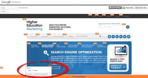
In-Page Analytics is a Google Analytics report that provides a visual representation of what’s being looked at and acted upon on your website, almost like a click or site goal tracking heat map. This report is one of the most effective ways to visualize traffic and visitor behavior on your site without getting lost in the tidal wave of data that GA provides. As you can see below it provides a simple summary of where people are clicking on each page of your site.
Note that the orange boxes indicate the share of total clicks that each link on the page has received. Hovering over an orange box reveals the exact number and percent of clicks received by the link. Note the orange line on the bottom of the page that indicates approximately 3 % of the total clicks made on this page were below this line on the page.
If you have goals set up in analytics you can refine the report to indicate the number of clicks on each page that have led to a goal conversions or indicate goal value, or for example, if a click on a particular page led to a newsletter request conversion.
This report can also provide page traffic details by segment. This allows you to think of each page on your site as a landing page for any general or custom segment and examine its click or goal performance relative to each other. For example if you want to determine how direct traffic vs search traffic is interacting with your page you could get the following analysis. The red circle indicates details of the clicks on the site search icon.
This report does have some limitations, including:
1. Once you remove a link from a page, no historical data is maintained on that link’s past traffic.
2. This report is based on destination links. If you have multiple links to the same destination page on one page, each link will report the total traffic to that destination link rather than specific traffic to that instance of the link.
3. No click data is available for subdomains or external links ie a facebook icon.
In page analytics provides you with a powerful tool to visualize traffic and goal performance on a page by page basis. I suggest you give it a try the next time you have to show one of your institutional clients the relative performance of each section of those important pages to help them understand how overall page priorities are governed by traffic, goals and goal value but in a really simple and visual way.
Good luck with this and please let us know how this strategy works for you . Or if you have other proven tactics that address this problem, we would love to hear about them.
Regards.
Practical Tip: This report is a particularly valuable resource to use when planning a site redesign, to establish your baseline page activity, by link and to help prioritize those areas that should be given precedence in your new design.
Practical Tip: If you are reviewing a number of pages and want to see a greater percentage of a page than the standard report format allows, open up another browser window, and go to same page on your site. While the In-Page Analytics report is open the orange indicator boxes will also appear on the new page you have just opened up. You can then click through your site with a much larger window to view the in-page stats.


