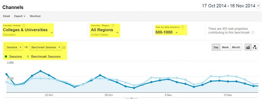
It has been a few years since we have seen “benchmarking” reports inside Google Analytics (GA). Personally, I am very excited to see it back and have been looking forward to digging into it to see what kind of information and functionality has re-emerged.
A Definition of Benchmarking
Simply put, benchmarking in GA is the process of comparing your website’s performance metrics to an average of similar schools web properties to understand how your site’s performance stacks up and to identify areas for improvement.

Benchmarking was rolled out within Google Analytics in September/October. There are a number of excellent posts out there that introduce it in detail, including a very good video from Karine Joly, discussing how it works and introducing its component reports, which are Channels, Locations, and Devices .
The goal in this post is a bit different from those other, more general introductions. I plan to dig a bit deeper into how the report is structured and to talk about some of the assumptions behind the numbers to help higher ed marketers understand how to works, how to interpret it and to avoid some of its limitations .
So lets look at the benchmarking report’s all important foundations and settings to see where the data comes from and what you’re really looking at :

1 ) First and foremost, where is the benchmarking data actually gathered from?
GA benchmarks are derived from the website traffic data of colleges and universities that opt-in to anonymously share their information with Google. Specifically, Google removes all identifiable information, combines the data with other anonymous sites in comparable categories and reports the aggregate trends. To access benchmarking report in GA you must anonymously share your institution’s data as follows.
Figure 1: To enable Benchmarking Reports in GA click both options as seen
above in your Analytics Accounts Settings
My off the cuff estimate of North American schools that currently opt-in ( see Table 2 below for more details) is quite low, somewhere between 10-20%. I emphasize this is my guess based on a estimate of the total number of institutions versus the total number of participating institutions in the benchmarking reports. I have no hard data to refer to on this and Google has not reported these numbers. But assuming my estimate is close, the implications are therefore that 1) only a small % of the total population of colleges and universities opt in at this time so be careful how much significance you place on them and 2) the population is probably made up of early adopters of the concept of sharing their data with the larger community so they are likely skewed towards the keeners who have a tendency to be ahead of the curve on most things, analytics. Clearly this will affect the benchmarks.
2) Industry Vertical
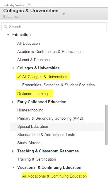
There are three categories within the Education Industry Vertical section that are of particular importance to note.  Most colleges and universities fit into the main category, “All Colleges and Universities”. But that fit’s not perfect if you’re a distance ed school, vocational career college or continuing ed department. Don’t get me wrong here, I am not complaining. I think we are actually quite lucky to have this level of detail in the report for our industry vertical. You just need to make sure you take the time to figure out where your school or programs best fit before you make the benchmarking comparisons. I wonder where big online schools like U of Phoenix fit into these categories? And just so you know, your own school’s category is defined within Google Analytics when your GA account was originally set up by whoever it was that did it at that point in time.
3) Country/Regions
Note that “All Colleges and Universities” from “All Regions” includes data from 4496 web properties from around the world. “US Only” includes 498 web properties, (as of Nov 17, 2014 when I did this research). I’d recommend you stick mostly to Canada or the US for your benchmarking comparisons. I am assuming at this point they are the “cleanest” in how they have been set up and reported. Unfortunately Distance Ed and Continuing Ed numbers drop off very quickly so there are not sufficient numbers to meet Google’s minimum data filter and as a result no results are shared. Lower level geographic comparisons are also very thin in total numbers so you probably will have to stick to comparing your self to the national norm versus what goes on in your particular state or province.
4) Size by Daily Sessions
“Size by Daily Sessions” is the rather arbitrary method that Google has used to group liked sized schools, by sessions, which is roughly equivalent to visitors, or at least total visits. (See sessions if you want the full and detailed explanation of a what a session is).
As you can guess, the total # of visitors to a college’s or university’s website range widely depending on the size of school and overall success of their website.  But for disussion purposes, let’s assume:
– a small career college might be 10,000 visitors a month
– a small community college might be 25,000 visitors a month
– an average sized university might be 60,000 visitors a month
– a big college or university might be 250,000 visitors a month
So when you review your figures against these” buckets” make sure you are comparing yourself to an appropriate category. By the way, comparing yourself to a bigger school if you are a smaller school is not necessarily wrong. You just need to recognize that it is a different animal but it will give you clear indications of what different kinds of activities are happening there versus your school’s activities.
The report provides you with the total number of web properties that are in each benchmark category for each region. So here is how the US and Canada stats break out.
|
Number of sessions |
US Colleges & Univ. Web properties |
Canada Colleges & Univ. Web properties |
|
|
1 |
0-100 |
437 |
421 |
|
2 |
100 – 500 |
474 |
478 |
|
3 |
500-1000 |
477 |
258 |
|
4 |
1000-5000 |
482 |
214 |
|
5 |
5000-10,000 |
482 |
45 |
|
6 |
10,000-100000 |
483 |
62 |
|
7 |
100000 + |
21 |
– |
|
Total properties in rows 2- 6 |
2419 |
1057 |
|
|
Estimate of Total # of Colleges and Universities by country |
~5000 |
~1000 |
Table 2: Number of properties currently reported on in College and University
Benchmarking (from Nov 17, 2014)
To be honest, I am not quite sure what to make of these numbers. I really can’t imagine what schools are in the 0-100 session group so I have left them out of my school totals. Also remember each school could have multiple sites/accounts and each school may or may not be sharing their data with Google from these multiple sites so the numbers incorporate a wide range of possibilities. These comments are not meant to be complaints about the data. I am very happy to have it. I do think though that we are at pretty early stages here and that at some point in the future this data will mature and become much more valuable to us.
So what can we take away from all of this?
- Well, as in all things analytics, you should always make sure you understand where your data comes from and what it represents before you try comparing it to your situation and/or interpreting it.
- Make sure you are comparing apples to apples as best you can and in the end if you have to compare apples to oranges, you are at least aware of that fact, and your insights therefore must be based on a general comparison of fruit only.
- To really build value into these benchmarking reports more schools have to share their data (anonymously of course) with Google and we will all benefit. So if you have not done that yet, get will it so these reports can help all of us better measure and improve our overall performance!
So what is your reaction to these new benchmarking reports? Do you see value in the comparisons they provide for your college or university to a generalized benchmark. Where did you get the most insight; channels, location or devices? Let us know what you think and please share you insights!


