Smart phones and tablets now account for about 20% of global web traffic (with smartphones at around 15% and tablets at about 5%) A recent straw poll we conducted during an HEM webinar with 25 higher education institutions confirmed this number, with mobile traffic accounting for an average of about 15%. And I think everyone will agree, these numbers are only going to increase.
In response to these rather compelling market stats and to the dizzying amounts of information available on the web on this subject, most higher ed marketers are actively seeking “mobile best practices” and advice on the best overall strategy for their website in an increasing complex, mobile oriented higher ed marketplace.
As we work with our partners, here are three mobile site strategies that we generally apply:
1) Create a general mobile version of your website
2) Create an admissions first mobile version of your website
3) Use a Responsive Website Design approach to your website redesign
The simplest and most straightforward option is to create a straight mobile version of your existing site. This involves retooling some or all your entire site content to fit the smaller screen format of mobile devices. It often involves trimming back a lot of the words and images of your full desktop version site to provide a simpler, scaled back “essentials” version. For the most part, this type of site has typically emphasized providing information to the local campus community and often de-emphasizes academics. Recruitment emphasis typically varies depending upon the private vs public nature of the institution. See the Mobile Higher Ed Directory a wide range of examples.
A recent survey report of 2300 students by Noel-Levitz, entitled The Mobile Browsing Behaviors and Expectations of College-Bound High School Students reports that, in fact, students are actively seeing academic program information using their mobile devices. This previously unrecognized predisposition argues for the growing popularity and use of the admissions-first mobile site. This variation involves creating a mobile version of a “prospective student” version of your main university or college website. It is focused primarily on recruitment and admissions, providing only material relevant to prospective students.
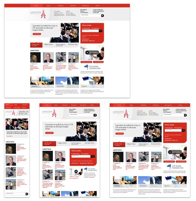
The third option is the Responsive Website Design (RWD) approach to your complete website ecosystem. RWD is a fairly new approach to overall website design that creates one overall “smart” design for your site that responds to whatever type of device that’s being used to access the content and presenting it accordingly, as in the example below. This approach generally requires a new design for your whole web system that incorporates the code that prioritizes and rescales content and images on your site

(Image from Examples of Great Responsive Website Design, www.tripwiremagazine.com)
So given these options what is the best approach to use to develop and maintain your mobile website?
Although not terribly satisfying, we find the best answer to this question to be that it depends. It depends on you, your organization and your web ecosystem. Once you understand the pros and cons to these approaches, your institution’s structure, mandate, goals, technology, human resources, and overall marketing and communications approach will usually point you towards the answer on how best to proceed.
We would like to hear about your approach to your mobile website and what your most important strategy considerations have been.


